|
Further to yesterday's post. Here is the progression to the finished painting: 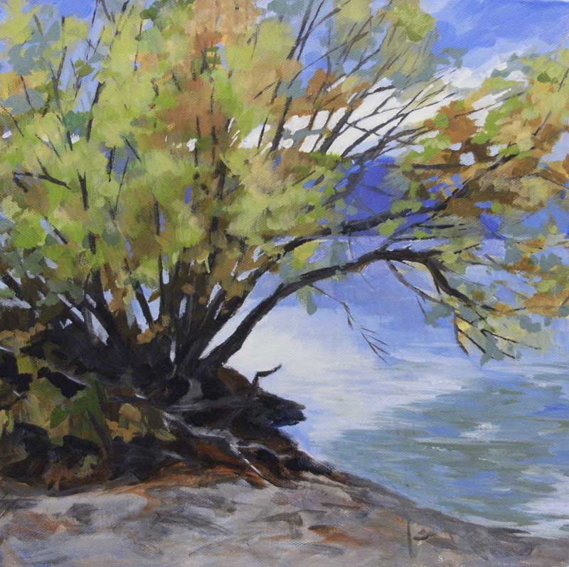
Stage 4
The next day, when I looked at the painting, I decided to lighten the sky and the water. The bush that made a vague appearance in Stage 2 and 3 was eliminated. I started to suggest logs and stuff under the tree and continued to scumble paint on the sand in the foreground. 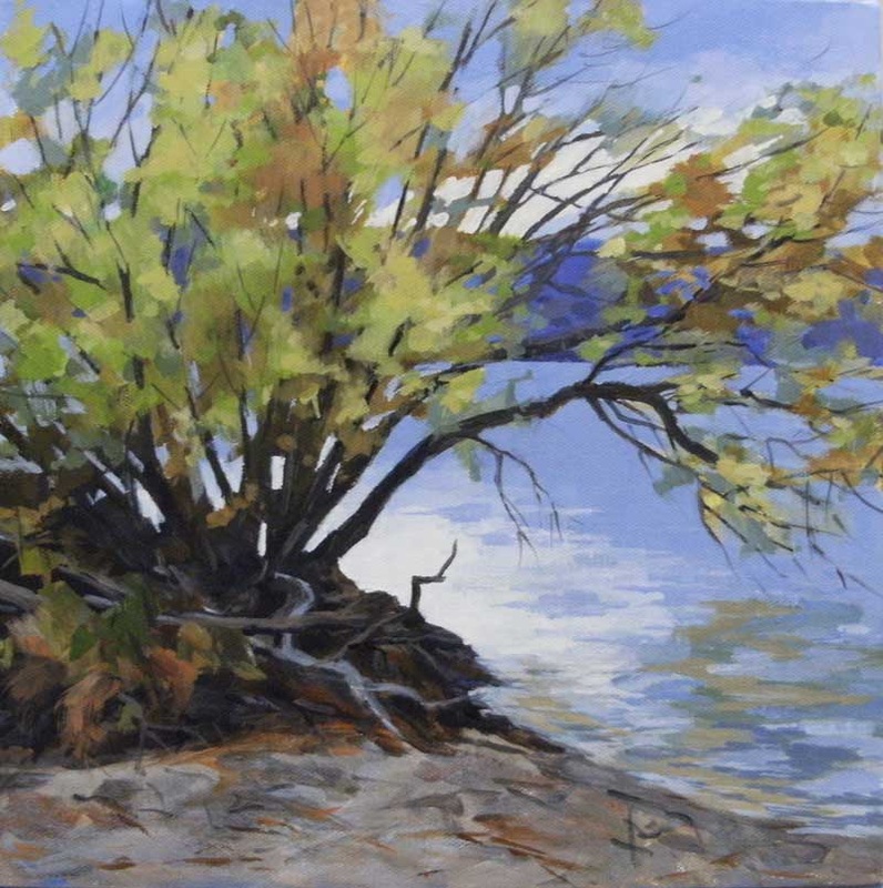
Stage 5
Now things are starting to come together. I redefined some branches that got lost under foliage and used some more negative painting to bring the background mountains and the water through the trees. I am starting to think the very light water next to the tree is too light. 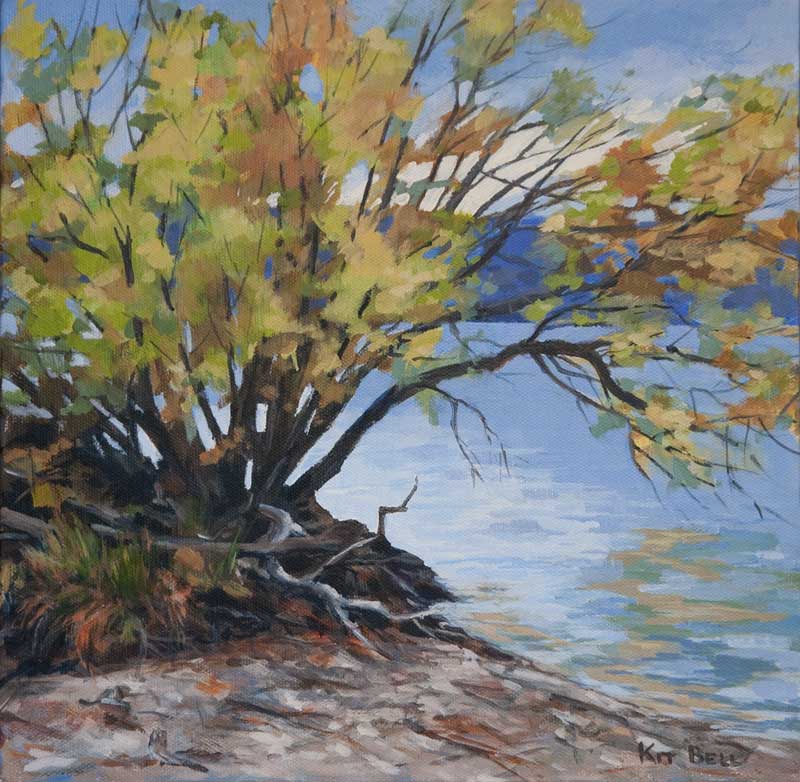
Finished painting
This is the final painting. I adjusted values here and there and painted enough twigs etc. on the beach to make it read as sand. Now it is just up to my husband to give it a name!
I hope you enjoyed sharing in the progress of this painting! Feel free to leave comments and questions.
0 Comments
Thank you to those who made it out to Opus in Kelowna on April 12, 2013 to see my presentation, the Power of the Underpainting. Here is the progression of the acrylic painting that I started during that demo. As promised, I will be posting photos of the painting as it develops. 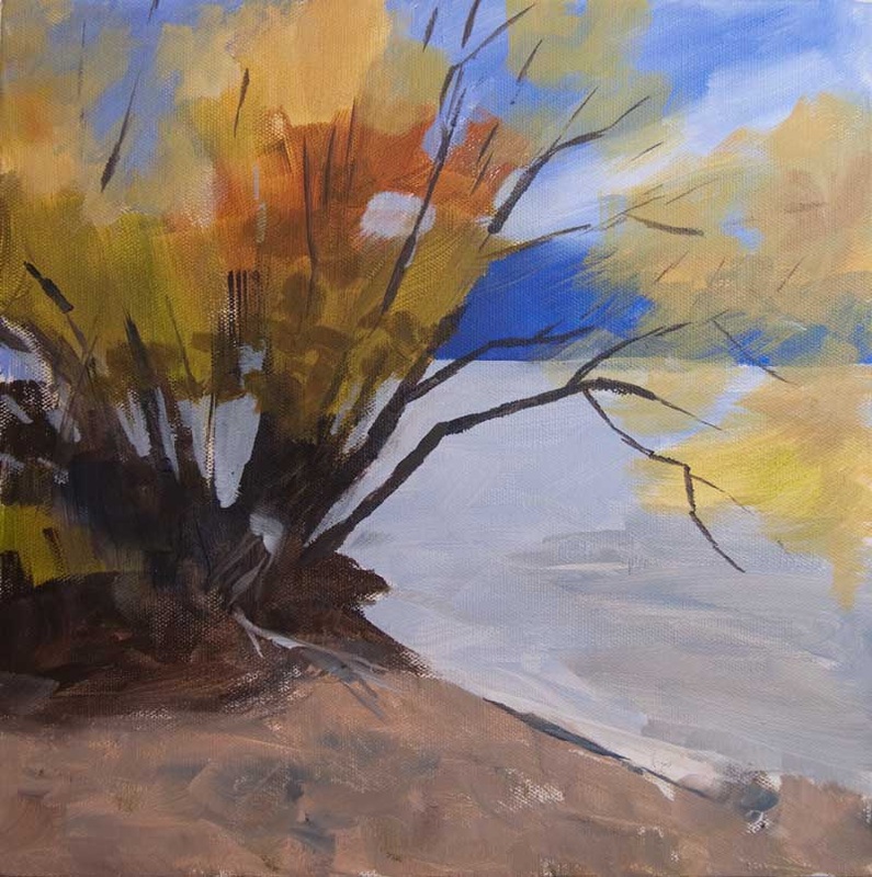
Acrylic Demo - Stage 1
When I got home I was quite pleased with the underpainting. I really liked the warm tones in the upper middle of the tree. I wanted to carry that colour elsewhere in the painting. I also felt that the dark area under the tree needed to come down further into the foreground to anchor all that bright foliage. I developed the foliage further, both with the warm colour, very cool (bluish) greens that I brushed on transparently and some brighter yellow greens. I added lots more tree structure (trunks and branches) varying the value from darker at the base of the tree to lighter and warmer towards the ends of the branches. 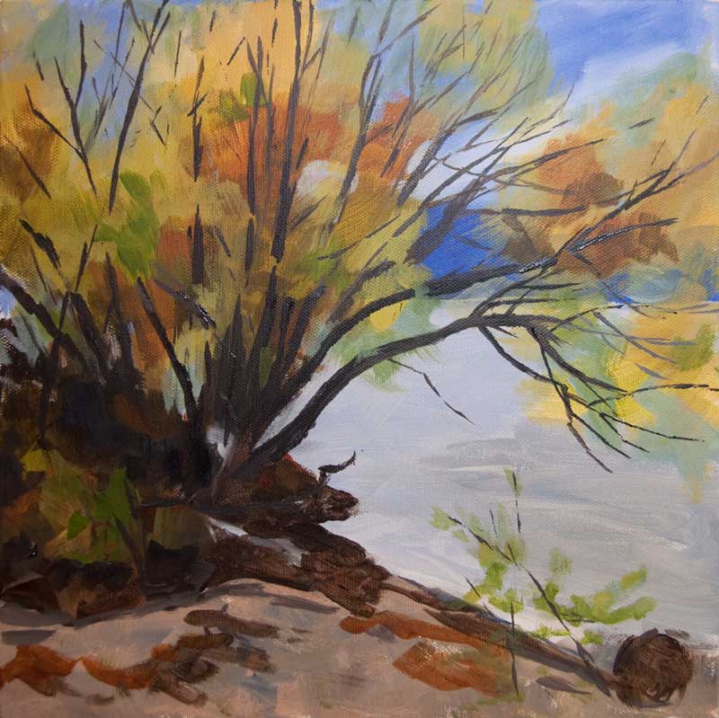
Stage 2
I added the light in the sky and reflected it in the water. I used negative painting to develop the sky further, working around the branches and foliage. I also developed the foliage further using both bright and neutral colours. 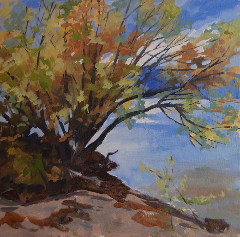
Stage 3
I step back at this point and check values. There is a light spot in the water that has to go. I develop the reflection of the branches in the water with a variety of blues from blue green to blue violet. Every time I get a chance, I scumble a bit more paint into the sand in the foreground. It is an easy way to build up the texture of the sand. At the end, a few brush strokes will pull that area together.
I take the time at this point (and use up paint on my palette) to paint the edges of the canvas. As I mentioned in the demonstration, I don’t frame my work. Continuing the image around the edges gives the painting a 3D look that many people like. Usually I do that as I am applying the underpainting and then I refine the edges towards the end of the painting. Check back soon for the completion of this painting.  Behind the Scene started out with an underpainting with a solid value structure and colours that interested me. If you have read any of my previous posts, you will know that I am a fan of the underpainting. The underpainting has been used for centuries to establish values and composition. In both pastel and acrylic, I find that building up a painting in layers, starting with the underpainting provides depth and allows for rich texture. I have also found that experimenting with colour in the underpainting can lead to a more expressive style of painting. On April 12, 2013, I will be a “Visiting Artist” at Opus in Kelowna. I will be doing a presentation on the power of the underpainting followed by demonstrations in both pastel and acrylic. I hope that you can join me. Click here for more information. Here is a copy of the PowerPoint presentation that I will be giving prior to the demos:
  Artists tend to be their own worse critics. It seems that few paintings measure up to the incredibly high standards we set ourselves. There is always that temptation to make changes.
I finished Misfit last week. But over the weekend, as I looked at it, the painting seemed a bit unbalanced. I did a bit of work on the source material in Photoshop and decided that adding another trunk on the left in the middle ground would improve the balance. Yesterday, I painted it in. But did I make the painting better? Did the original need improvement? You tell me. Please let me know if a) The painting was fine the way it was b) The change made the painting better c) The change made the painting worse I look forward to your comments! 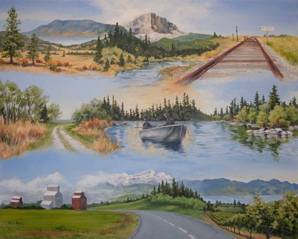
There and Back, 24" x 30", Acrylic, $600 - Location - all over Western Canada
Every year, the Kelowna Art Gallery holds a Members Show. And each year they come up with a challenging theme for the show. When I was reflecting on this year’s theme of Maps and Mapping, I began to think of the earliest maps that mankind used. These were basically images of landmarks that, if followed, led you to a specific location, perhaps for hunting or fishing. This led me to think of the annual journey that my husband and I take each spring to Northern Manitoba for fishing (and, of course, painting). 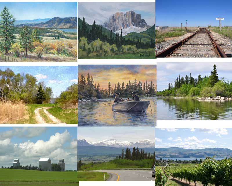 I put together nine pictures using Photoshop I decided to make a painting that would be composed of images from our journey to The Pas, Manitoba and back. I sifted through the literally thousands of pictures I have taken over the years and put together nine. Some of these images are actually paintings that I had already done. The images start in the Okanagan with the view of Duck Lake from Beaver Lake Road, then through the Rockies, across the prairies to Manitoba and a view of poplar trees screening a large lake. The central image shows that the fishing is good at sunset followed by another part of the lake where we have had great fishing. Then back through the prairies to the Rockies and home to the vineyards of the Okanagan. 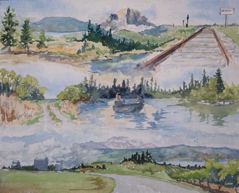 Colour Study I did a pencil sketch, playing with the way I might tie these images together. It looked good so I proceed with a colour study, done in watercolour.
Pleased with the result, I decided to go ahead with a full painting (24” x 30”) in acrylic. The result is what I have come to think of as my Journey Painting. I hope you enjoy it. 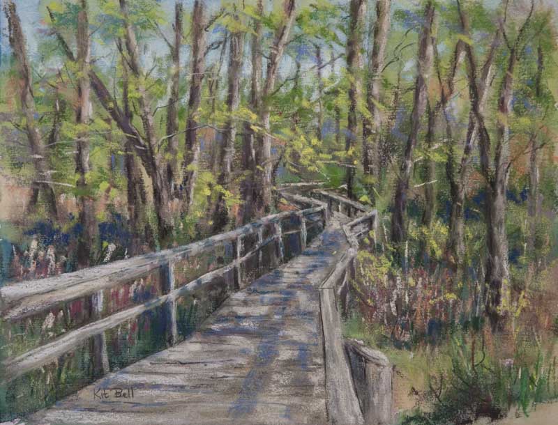 Maude Roxby Boardwalk, 10.5" x 13.5", Pastel over Watercolour, Framed. Location - Maude Roxby Bird Sanctuary, Kelowna, BC Last fall I joined the Kelowna Painters Studio, a group of artists that meet to paint on Wednesdays at the Rotary Centre for the Arts. It is a great way of exploring your creativity. Ideas pop up and fly around the room. Seeing how others handle a subject leads to more ideas of your own. This group has been in existence for 20 years! The membership has changed over the years but the core idea hasn't. This year we decided to hold a show to celebrate 20 years of artistic creativity. The show, entitled "Art at the Top of the World" is going to be held on August 11th from 11 am to 5 pm at the very elegant home of one of our members - Patty Feist. Wine and cheese will be served. For an invitation and map to Patty's, click here. As a way of giving back to our community, we are donating 20% of all sales for the day to the HeART Cart program at the Kelowna Hospice. In addition, I have donated the painting below to be raffled off, with 100% of the proceeds to go the the Hospice. (Click the painting for a larger version.) This painting was done "en plein aire" (which simply means it was painted on location). I started with a watercolour underpainting and then developed the painting further with pastel. It was early in the spring and the trees were just budding out.
I hope you can attend the event. If you can't and would like some tickets for this painting ($5 per ticket or 3 for $10) just contact me by email or call me at 250-868-3525. Hope to see you at the show! 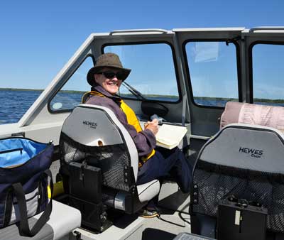 My husband and I just got back from over six weeks camping and fishing in the lakes of Northern Manitoba. My husband is an avid fisherman and while I like fishing too, I take the opportunity while we are there to paint and photograph the incredible Canadian Shield landscape. 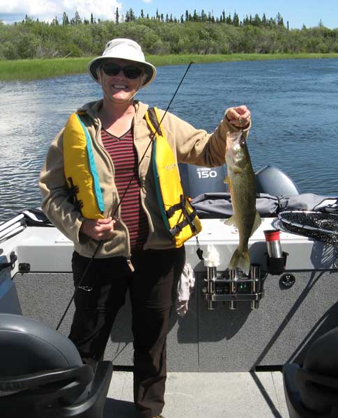 Between catching Walleye and Northern Pike, I sketched with ink and watercolour from the boat. We explored Cormorant Lake, Little Cormorant Lake and Frog Creek during our holiday (all of which are just outside of The Pas, Manitoba). There are many beautiful spots to paint on this water system. 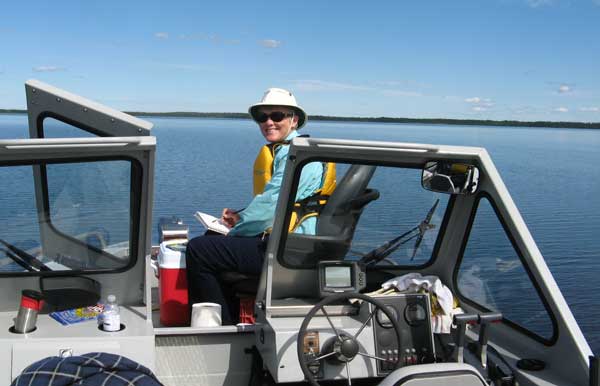 I would start with a quick sketch in pen to place the major elements. Then I added watercolour to the sketch, sometimes using conventional brushes but more often just using a water brush. This handy tool has a barrel that you fill with water. It is great for quickly adding colour to a sketch. The amount of water in the barrel is enough to paint 1 larger or several smaller sketches. Between massive slabs of lichen covered rocks, trees, a wide variety of skies and beautiful reflections, there was more than enough to get my creative juices flowing. Most of my paintings were done in small watercolour sketchbooks. Everything I used was contained in one bag – sketch pads, drawing materials, watercolour palette and collapsible water container (there was no lack of water available for painting!). I find that painting on location gives me a much better appreciation of the landscape than simply taking photos to work from later. The act of painting on the spot forces you to summarize the scene – to get to the essence of the landscape. I took lots of pictures (over 4500!!) to refer to later but several of my small sketches will serve as the leaping off point for studio pieces next winter. Enjoy the paintings! Just click on any thumbnail to view a larger version.  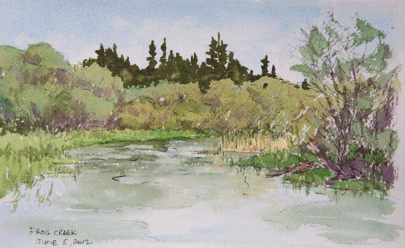 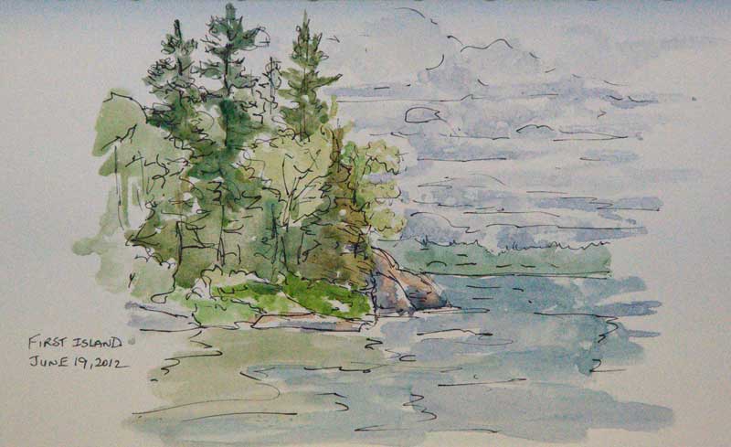 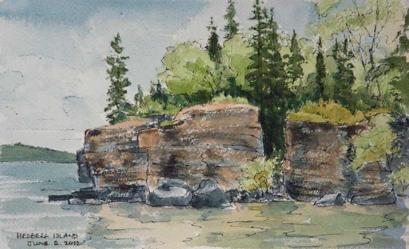 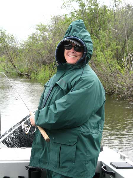 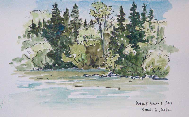 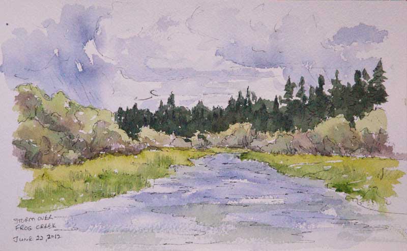 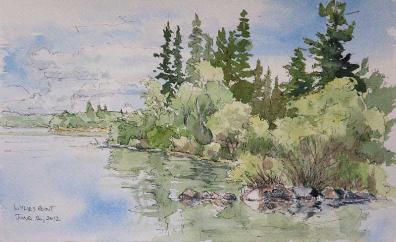  At the Ingate, 20" x 20", Acrylic, SOLD For those of you who knew me during my equestrian career, you will be interested to know I have finally painted a horse!
For 20 years, I was a coach and trainer working with hunters and jumpers and their riders. I owned Sunridge Equestrian Centre here in Kelowna and the 24/7 schedule kept me from painting for nearly 18 years. Many young equestrians grew up in my barn, learning the fine art of navigating over a 1000 pounds of horse around a course of fences from cross-poles to 4 feet tall. We held shows there twice a year and many teenagers got their first job in my stable. I sold the barn in 2005 and retired from coaching in 2006. I miss the horses and the students but I do enjoy having the time to paint and travel. Many of my former students and their parents have seen me at the Lake Country Art Walk shows and asked if I had painted any horses. I must admit, I had been avoiding the subject. Horses to me are all individuals with their own unique personalities that must come out in a painting, just like a portrait. I flirted with the subject matter, including cows in several of my paintings over the last year. Then came the call. A good friend wanted me to paint a picture of her daughter and her horse as a surprise for her daughter (who is all grown up and married!). I agreed. It is good to step outside of your comfort zone as an artist and this was the push that I needed. For those of you who were at Sunridge in the late 90’s and early 2000’s, here is my painting called “At the Ingate”. See if you can figure out who it is and where it is! And yes, this is also my first self-portrait. Last fall I joined the Kelowna Painters Studio group, a group of artists that meets every Wednesday to paint and share ideas. Involvement in such a group of artists has been highly beneficial to me and has encouraged me to “spread my wings”, so to speak, as an artist. Several of the artists in the Kelowna Painters Studio start a painting on canvas that has been prepared with black gesso. Working on a dark surface fits right in with the “dark to light” working method of the oil or acrylic painter. You seem to pull out the lights and the brighter colours from the dark surface. I was interested in trying something similar but I am not a fan of black or of a single toned surface for my work, so I decided to take my current method of starting with an underpainting a step further. Rather than going for the local colour in the underpainting I decided to go to a darker colour. And rather than allow the underpainting to become too complex, I decided to go very broad brush with it. 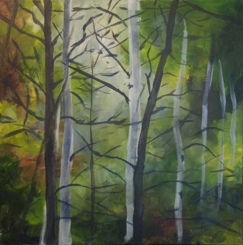 First stage - Underpainting Using the reference material to suggest colours and patterns in the underpainting, I started this canvas with darker cool greens and lighter warm greens with some earth tones and lighter areas (still relatively dark) mixed in. As I brushed on the paint, I tried to allow underpainting to take on its own patterns of warm and cool, light and dark. I set the painting aside for a while to allow shapes and patterns to emerge. Then I went in with more colour, following the shapes of the branches and allowing the colours to break up areas even further. At this stage, I again set the painting aside where I could see it regularly. 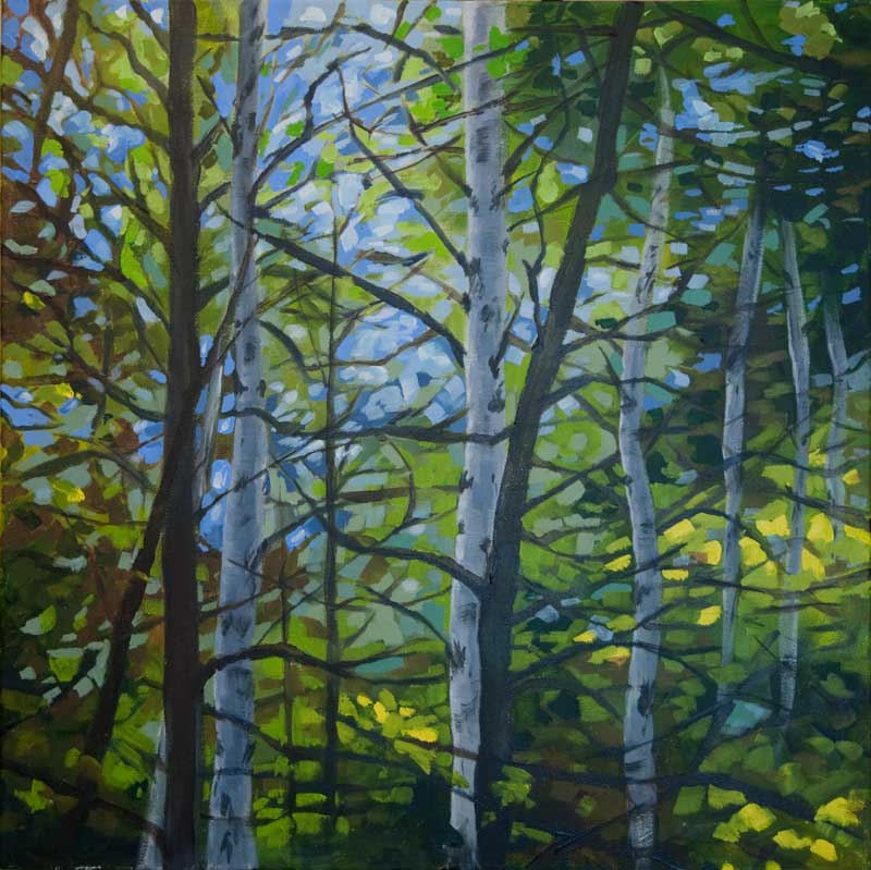 Second Stage - developing patterns and colours I decided at this point that I needed to strengthen the pattern of the tree trunks. There were two dark trunks both leaning right that created a distracting movement in the painting. I changed the direction of one and put a foreground light coloured trunk on the right. Much better. Now, I reviewed the photo of the underpainting and worked with this as the reference. I continued to develop the foliage and “sky holes”. 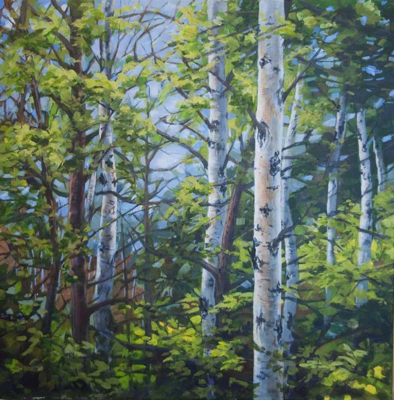 Third Stage - develop the foliage and trunks Now the painting was almost done. I put it in the living room for a week to mull over. I decided I wanted to draw the viewer’s eye toward the trunks on the left as a secondary focal point. As the eye is drawn by increased contrast of lights and darks, I increased the backlight coming through the trees in this area. Below is the finished painting - Mysterious Light, 20" x 20", Acrylic, $350. 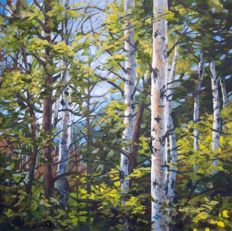 Finishing the painting - refining and balancing the composition  This summer I took the opportunity provided by the nice weather to get outside to paint. After wrestling with my very heavy pastel box and struggling with my rapid drying acrylics, I decided I needed a more suitable method to capture the great outdoors. The day after the Lake Country Art Walk Show, I was too tired to pack a lot of stuff so I took my watercolour palette and at the last minute, decided to throw in my pens and ink bottle. I immediately fell in love with this combination of media. Not long after, I decided to submit some work to the Lake Country Art Gallery for their annual Under 100 show. This show is limited to works under 100 square inches and priced at under $100. It's timing (just before Christmas) is no coincidence. This very successful show is an idea place to find that perfect gift for someone.  Little Wilderness, 6" x 8" Acrylic, $85 The plein aire works I had been creating were perfect. I also decided to do several small acrylics for the show (from the comfort of my studio).
I will also be exhibiting a number of these smaller paintings at the For the Sake of Art Almighty annual show at the Rotary Centre for the Arts on November 12 and 13. These works have been a lot of fun to do and I have learned a lot as well. I hope you can make it to one or the other show. If you make it to the show at the Rotary Centre for the Arts, stop by my booth and say hello! 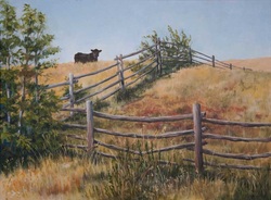 Moo To You Too, 18"x24" Acrylic Having worked extensively in oils in the past and exclusively in pastel for the last 4 years, returning to painting on canvas provided some interesting challenges! I found out when tackling my first oil painting in years that I have become sensitive to the solvents and mediums used in oil painting. So I got a set of acrylics thinking that it would be just like oil. Oh, nooo. Not even close. But having worked out a technique with pastel that utilizes a watercolour underpainting, I thought I would try something similar in acrylic. It took a couple of paintings and some head scratching but I have now developed a friendship with acrylic. 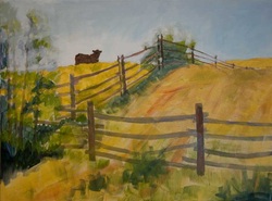 First, I established the drawing with charcoal, referring to sketches I had made to work out the composition. The drawing for this painting was very important. The shape of the fence and the placement of the elements had to be right for this painting to work. Once I had the drawing the way that I wanted it, I painted the fence with thin paint to lock it in. Because acrylic dries so fast and will not mix with subsequent layers, I was able to block in the rest of the foreground in thin paint. I tried to follow the contour lines of the land. Lastly I painted the sky with thin paint allowing it to overlap the roughed in trees and shrubs. I used gloss medium to thin the paint with a little bit of water. Water alone would not provide a strong enough paint film. 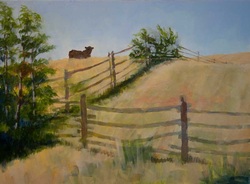 The next stage of the painting was to paint the sky a bit thicker, smoothing out the transitions and correcting the temperature. Then I moved on to the grasses in the distance and foreground, adding some colour variation as I went. I try to think of the colour beneath the colour it will end up. I also worked on the shrub at the top of the hill and the trees on the left. Nothing is finished yet. Before I quit the session, I painted some sky colour back into the shrub – it had gotten too dense. 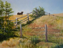 Looking at the painting the next day, I decided that the hollow behind the foreground fence needed definition and the shadow of the fence going up the hill was too straight. I worked over the colours and values of these areas. I did some negative and positive painting in the shrub and the grove of trees and modified some shapes. To get a handle on the values, I worked on the fence going up and over the hill and gave the cow another coat and some definition. To finish, I built up the rest of the fence and added the grasses in the foreground.
Working this way with the acrylic, in thin layers, allowed me to build texture and depth of colour. It also allowed me to see where I was going as I went along. 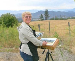 Ah! Summer time. Time to get out of the studio to sketch and paint on location. Painting on location or "Plein Air" painting, as it is known, is a great way capture the beauty of our Okanagan valley. Although I also take photos and work with them back in the studio, nothing replaces actually being there. And since cameras do not tend to record the scene the same way as our eyes see it, being there is essential to capturing the landscape in a painting as it really is. 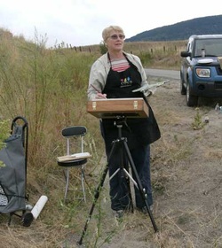 I am lucky to have a friend to paint with - Sharon Rose, a very talented artist from Vernon, BC. She and I go out about once a week to paint.
Although painting on location has its challenges - changing light, clouds that won't hold still, bugs and other inconveniences, I wouldn't give it up for anything. 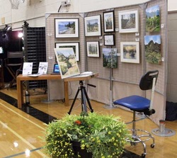 Thank you to everyone who dropped by my booth at the Lake Country Art Walk show on the weekend. I very much appreciate the support and comments on my recent work!
This show was very successful for me. I sold a total of 8 paintings. With all those empty walls at home, I am very motivated to continue to paint this fall. Once again, thanks! 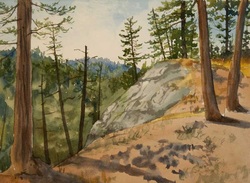 People frequently ask about my technique and the use of watercolours with pastels. The paper that I prefer is Rives BFK printmaking paper. It is fully archival and has a smooth surface that allows me to paint freely without imposing a texture. Because it comes in white and working in pastel on a white surface can be difficult, I like to start with a watercolour underpainting. 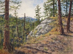 Once I have let the underpainting dry, I start to work with the pastels. In some areas, I will let the watercolour stand alone, in other areas, I enhance or even replace the watercolour with the pastel. I work with the painting until I reach
a point where many areas are resolved and it is time to pause. I call this the 80/20 point. About 80% of a painting is completed in about 20% of the total time. The remaining 20% - the fine tuning and resolution - takes about 80% of the time. During this final stage of the painting, I place it where I will see it in passing frequently during the day. Everytime I see it, it will show me something. Some things are good, some things will need modifying. I evaluate the painting - does it represent the feeling I had when I stood there? Over a few days, I will determine what the painting needs to complete it. |
AuthorThe Okanagan provides inspiration wherever you look. I enjoy both painting on location and working in my studio. For more information contact me at kitbell@shaw.ca Archives
November 2023
Categories
All
|
||
 RSS Feed
Gallery Pages |
Information Pages |