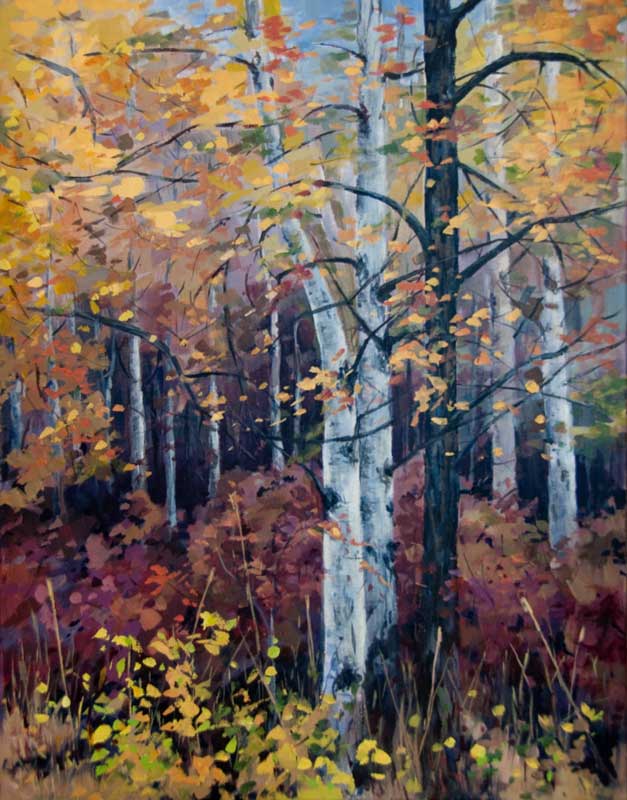
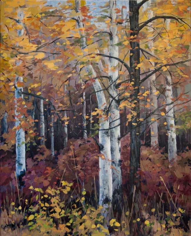
  Artists tend to be their own worse critics. It seems that few paintings measure up to the incredibly high standards we set ourselves. There is always that temptation to make changes.
I finished Misfit last week. But over the weekend, as I looked at it, the painting seemed a bit unbalanced. I did a bit of work on the source material in Photoshop and decided that adding another trunk on the left in the middle ground would improve the balance. Yesterday, I painted it in. But did I make the painting better? Did the original need improvement? You tell me. Please let me know if a) The painting was fine the way it was b) The change made the painting better c) The change made the painting worse I look forward to your comments!
18 Comments
Suzanne Briard
11/5/2012 06:19:09 am
I prefer the second one. It seems more finished
Kit Bell
11/5/2012 07:19:29 am
Thanks, Suzanne!
Beverly Shlachetka
11/7/2012 09:28:45 am
b.) The second one is better. Also had someone else look at it and the second one wins!
Kit Bell
11/8/2012 02:03:45 am
Thanks for the feedback!
Colleen Blackwood Listro
11/5/2012 07:31:40 am
Kit... they are both wonderful; however, I prefer the one as it was.
Pat Howard
11/5/2012 07:45:50 am
b.
Susie Richards
11/15/2012 07:49:35 am
Hi Kit,
Kit Bell
11/16/2012 02:13:41 am
Thanks, Susie. I was concerned that the balance was off before I added the tree.
Arlene Tuttle
11/15/2012 08:05:29 am
I like the second one best. The addition of the birch on the left gets one's eye moving over the canvas more--and it seems more balanced. Great work Kit. I'm enjoying all of my "Kit Bell's"!!
Kit Bell
11/16/2012 02:14:50 am
Thanks, Arlene! Keeping the viewer's eye engaged is a major challenge when painting.
Linda Butcher
11/15/2012 08:05:56 am
Hi Kit,
Kit Bell
11/16/2012 02:23:21 am
Thanks, Linda! The other thing the extra tree does, is it actually makes the painting look wider!
Doris Maron
11/15/2012 09:35:01 am
Hi Kit,
Tove Sorensen
11/16/2012 05:39:52 am
Hi Kit!
Margie
11/16/2012 03:45:24 pm
Hi Kit,
Kit Bell
11/17/2012 02:14:35 am
Hi Margie
Lizann Allan
11/17/2012 03:42:01 am
Hi Kit - it's like spot the difference! But once I looked more carefully I like the first one better, just because it is less symmetrical. the finished result is great too, it's a lovely painting and an interesting exercise - thanks for sharing. Lizann 7/13/2014 02:25:38 am
I definitely prefer the one with the added tree. It does balance the painting and moves the eye from the centre of the painting. Leave a Reply. |
AuthorThe Okanagan provides inspiration wherever you look. I enjoy both painting on location and working in my studio. For more information contact me at [email protected] Archives
November 2023
Categories
All
|
 RSS Feed
Gallery Pages |
Information Pages |