|
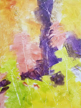
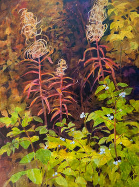
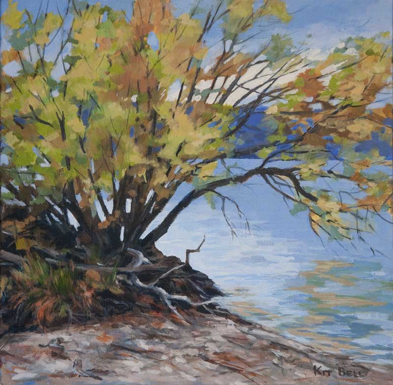
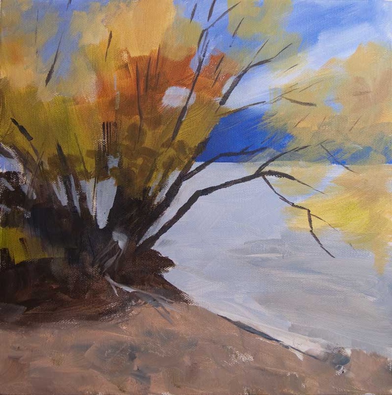
I am very pleased to be doing a demonstration at OPUS on Saturday, November 24th at 10 am and 1 pm. I will be demonstrating how I start with a loose underpainting such as this one: And then develop it in layers with both negative and positive painting, transparent and opaque paint, into the finished image: I will be starting with a PowerPoint presentation. For those of you who are interested, here is a copy of the presentation and notes.
0 Comments
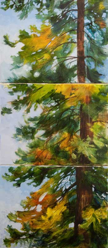
So, this is the story of the best idea I never had! A couple of days ago, fellow artist Carney Oudendag brought some of her paintings to my studio to be photographed. I met Carney at last year’s Lake Country Art Walk in one of those 15-minute Paint Off’s. As I was processing her images on my computer, we were chatting about this year’s upcoming Art Walk and about doing demos for OPUS and other art organizations. I mentioned that I had a stack of unfinished demo paintings. While she was waiting for me to finish, Carney started to look through my stack of rejects. “These are really quite good – for demo paintings” she says in a bright cheery voice. While I was trying to figure out how to process that, she brings three out. They are each pretty much of the same section of the same tree. I quite like these three but felt they didn’t stand up as individual paintings. When I demo, I like to have the same image in different stages of development so I can demonstrate a wider range of techniques but individually – I didn’t know if they are all that interesting. Then Carney did an amazing thing! She stacked up the three paintings one above the other and declared “look, a triptych!” I was dumbfounded. I had never thought of doing that. And what was really amazing was how well the three paintings fit together to make a quite impressive larger painting. Obviously, it needs some work to pull it all together but the potential is there. As artists, we tend to work in isolation, painting away by ourselves in our studios. But this is what can happen when two creative minds meet! So, I have two questions for you:
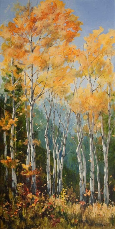
I find as I progress along the journey of making art, my creative process undergoes changes as I absorb information, attend shows and participate in workshops. I find it useful to periodically record how I went about creating a particular painting. Here is the story about how I created "The Clan", a 36" x 18" acrylic on canvas that I just completed.
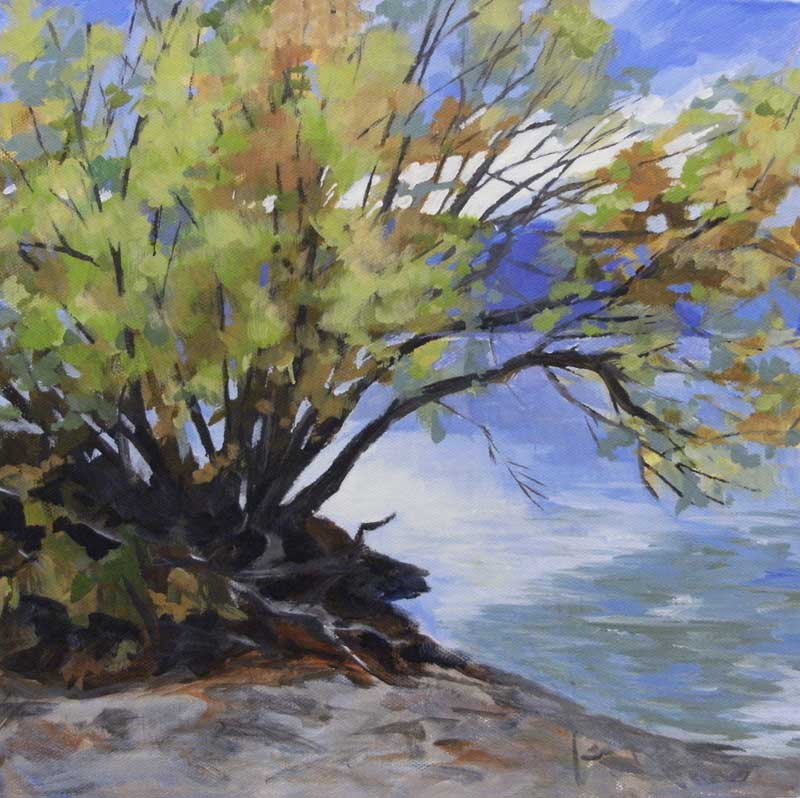
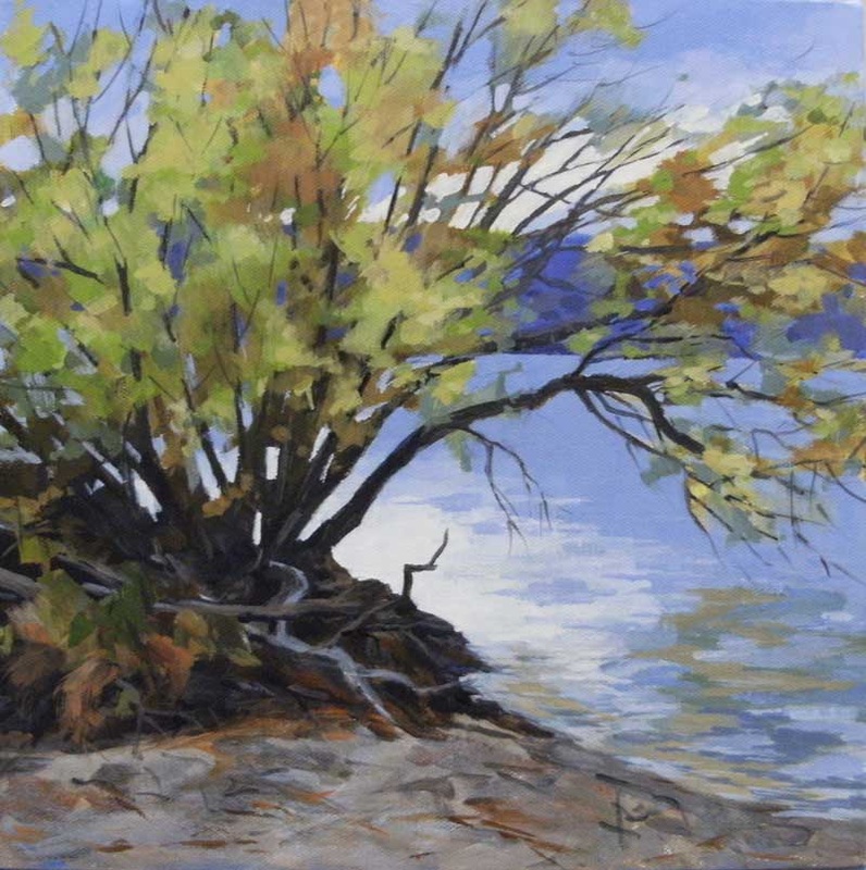
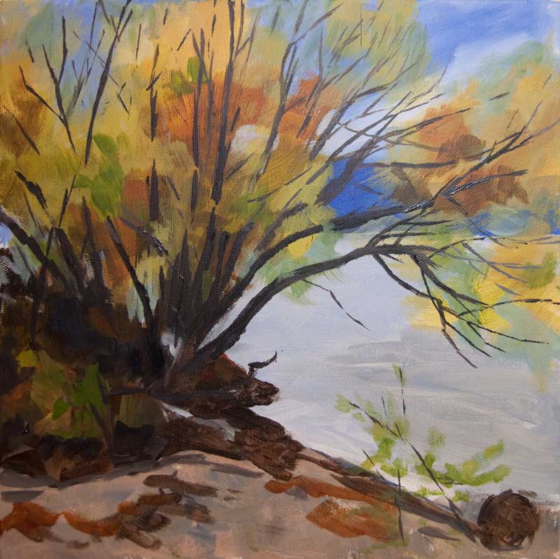
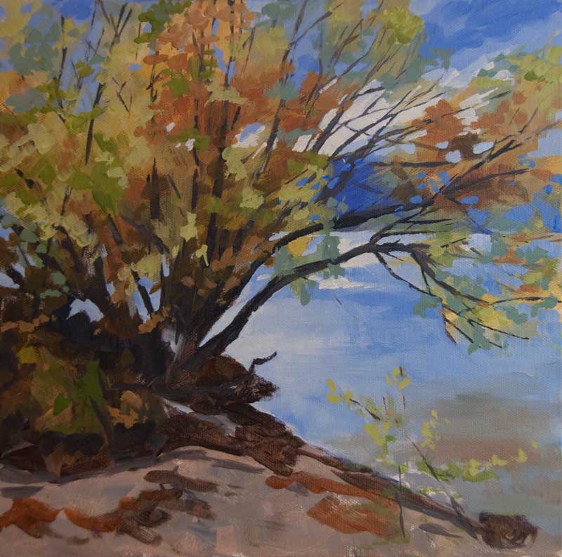
Concept I saw this group of trees while Bill and I were out getting firewood. I sketched a similar group that was across the road while we were there and took numerous photo references. I worked out the concept on a thumbnail sketch and decided to make more transitions in the background to avoid a line going across the middle of the canvas. I decided to go with a format of 36 by 18 to really emphasize the tall thin nature of the trees. Beginnings I put on an underpainting of reasonably thick paint (not just a diluted stain) so that any areas that did not need further coats would have a reasonable quality of surface. I put on the underpainting in sections so that I could spray, scrape and move the paint around to get some texture. As I was developing the image, a strong diagonal from upper left towards the lower right appeared. I left this and accentuated it in later layers. I painted two gradations for the background hills to provide atmosphere and depth and another two for the middle and foreground trees. Then I painted in the trunks of the trees paying attention to the spacing of the trunks and the thickness, working on maintaining variation. I also referred to the reference photos and picked up interesting twists and turns in the trunks. Middles I started to work around the painting, adding some transparent and translucent layers to the foliage and to the background. I worked in sections so that I had the time to spray, wipe, scrape, etc to soften transitions and develop texture that suggested the subject matter. I painted in the dark green of the fir trees on the sides but the contrast was too harsh so I sprayed with water and wiped a bit to soften it. That worked very well to push them behind the aspens. I also worked on the light on the trunks, painting the darker middle, a duller, reflected light on the right sides and a brighter, direct light on the left. I started to suggest more branches. At some point I took some very diluted sky colour and splattered it around the painting. Later I glazed over some of the splatters to muted them without losing them. I added some texture to the foreground using paint mixed with gel medium and applying it with a painting knife. When that was dry, I dry brushed colour over it to give the suggestion of grasses and brush. Endings After evaluating it for a while, I decided that the value of the trunks and the background were too close so I lightened the trunks and reworked the direct and reflected light. There was a nice diagonal happening with the twists of the trunks so I hit them with some extra light in key places. I repainted the top right corner sky. It was too light and too busy so I went with an ultramarine blue thickened with some gel. The colour was a beautiful complement to the foliage’s yellows and oranges. I painted a limited number of sky holes and ratty edges to the foliage, trying to repress my urge to play with the patterns too much. I also applied some transparent stains of purple and green in parts of the foliage to give a sense of the light coming from the left. I used the Fineline nibs and some of the High Flow Acrylics to add fine branches to the trees. Some of the lines, I modified with a small brush to widen and merge with the trunks. The last thing I did was modify the foliage that was on the left coming down into the foreground and I added some dots here and there of leaves. Further to yesterday's post. Here is the progression to the finished painting: The next day, when I looked at the painting, I decided to lighten the sky and the water. The bush that made a vague appearance in Stage 2 and 3 was eliminated. I started to suggest logs and stuff under the tree and continued to scumble paint on the sand in the foreground. Now things are starting to come together. I redefined some branches that got lost under foliage and used some more negative painting to bring the background mountains and the water through the trees. I am starting to think the very light water next to the tree is too light. This is the final painting. I adjusted values here and there and painted enough twigs etc. on the beach to make it read as sand. Now it is just up to my husband to give it a name!
I hope you enjoyed sharing in the progress of this painting! Feel free to leave comments and questions. Thank you to those who made it out to Opus in Kelowna on April 12, 2013 to see my presentation, the Power of the Underpainting. Here is the progression of the acrylic painting that I started during that demo. As promised, I will be posting photos of the painting as it develops. When I got home I was quite pleased with the underpainting. I really liked the warm tones in the upper middle of the tree. I wanted to carry that colour elsewhere in the painting. I also felt that the dark area under the tree needed to come down further into the foreground to anchor all that bright foliage. I developed the foliage further, both with the warm colour, very cool (bluish) greens that I brushed on transparently and some brighter yellow greens. I added lots more tree structure (trunks and branches) varying the value from darker at the base of the tree to lighter and warmer towards the ends of the branches. I added the light in the sky and reflected it in the water. I used negative painting to develop the sky further, working around the branches and foliage. I also developed the foliage further using both bright and neutral colours. I step back at this point and check values. There is a light spot in the water that has to go. I develop the reflection of the branches in the water with a variety of blues from blue green to blue violet. Every time I get a chance, I scumble a bit more paint into the sand in the foreground. It is an easy way to build up the texture of the sand. At the end, a few brush strokes will pull that area together.
I take the time at this point (and use up paint on my palette) to paint the edges of the canvas. As I mentioned in the demonstration, I don’t frame my work. Continuing the image around the edges gives the painting a 3D look that many people like. Usually I do that as I am applying the underpainting and then I refine the edges towards the end of the painting. Check back soon for the completion of this painting. 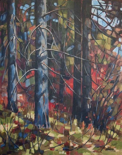 Behind the Scene started out with an underpainting with a solid value structure and colours that interested me. If you have read any of my previous posts, you will know that I am a fan of the underpainting. The underpainting has been used for centuries to establish values and composition. In both pastel and acrylic, I find that building up a painting in layers, starting with the underpainting provides depth and allows for rich texture. I have also found that experimenting with colour in the underpainting can lead to a more expressive style of painting. On April 12, 2013, I will be a “Visiting Artist” at Opus in Kelowna. I will be doing a presentation on the power of the underpainting followed by demonstrations in both pastel and acrylic. I hope that you can join me. Click here for more information. Here is a copy of the PowerPoint presentation that I will be giving prior to the demos:
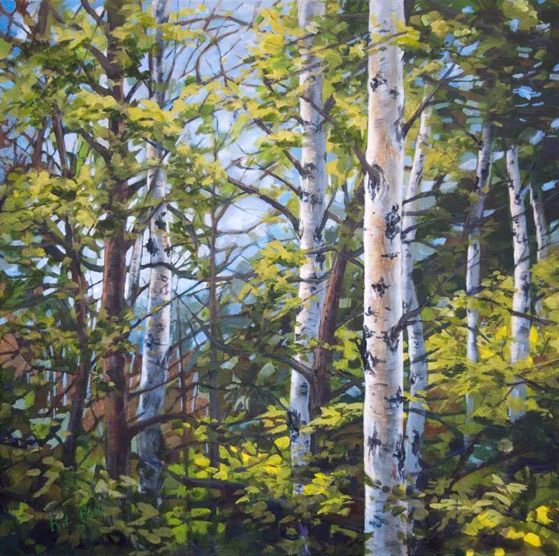
Last fall I joined the Kelowna Painters Studio group, a group of artists that meets every Wednesday to paint and share ideas. Involvement in such a group of artists has been highly beneficial to me and has encouraged me to “spread my wings”, so to speak, as an artist. Several of the artists in the Kelowna Painters Studio start a painting on canvas that has been prepared with black gesso. Working on a dark surface fits right in with the “dark to light” working method of the oil or acrylic painter. You seem to pull out the lights and the brighter colours from the dark surface. I was interested in trying something similar but I am not a fan of black or of a single toned surface for my work, so I decided to take my current method of starting with an underpainting a step further. Rather than going for the local colour in the underpainting I decided to go to a darker colour. And rather than allow the underpainting to become too complex, I decided to go very broad brush with it. 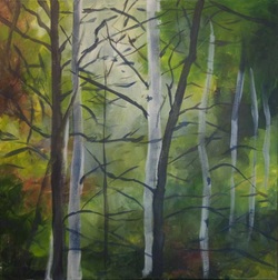 First stage - Underpainting Using the reference material to suggest colours and patterns in the underpainting, I started this canvas with darker cool greens and lighter warm greens with some earth tones and lighter areas (still relatively dark) mixed in. As I brushed on the paint, I tried to allow underpainting to take on its own patterns of warm and cool, light and dark. I set the painting aside for a while to allow shapes and patterns to emerge. Then I went in with more colour, following the shapes of the branches and allowing the colours to break up areas even further. At this stage, I again set the painting aside where I could see it regularly. 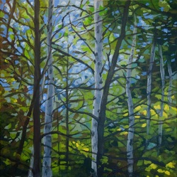 Second Stage - developing patterns and colours I decided at this point that I needed to strengthen the pattern of the tree trunks. There were two dark trunks both leaning right that created a distracting movement in the painting. I changed the direction of one and put a foreground light coloured trunk on the right. Much better. Now, I reviewed the photo of the underpainting and worked with this as the reference. I continued to develop the foliage and “sky holes”. 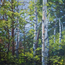 Third Stage - develop the foliage and trunks Now the painting was almost done. I put it in the living room for a week to mull over. I decided I wanted to draw the viewer’s eye toward the trunks on the left as a secondary focal point. As the eye is drawn by increased contrast of lights and darks, I increased the backlight coming through the trees in this area. Below is the finished painting - Mysterious Light, 20" x 20", Acrylic, $350. 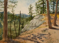 People frequently ask about my technique and the use of watercolours with pastels. The paper that I prefer is Rives BFK printmaking paper. It is fully archival and has a smooth surface that allows me to paint freely without imposing a texture. Because it comes in white and working in pastel on a white surface can be difficult, I like to start with a watercolour underpainting. 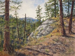 Once I have let the underpainting dry, I start to work with the pastels. In some areas, I will let the watercolour stand alone, in other areas, I enhance or even replace the watercolour with the pastel. I work with the painting until I reach a point where many areas are resolved and it is time to pause. I call this the 80/20 point. About 80% of a painting is completed in about 20% of the total time. The remaining 20% - the fine tuning and resolution - takes about 80% of the time. During this final stage of the painting, I place it where I will see it in passing frequently during the day. Everytime I see it, it will show me something. Some things are good, some things will need modifying. I evaluate the painting - does it represent the feeling I had when I stood there? Over a few days, I will determine what the painting needs to complete it. |
AuthorThe Okanagan provides inspiration wherever you look. I enjoy both painting on location and working in my studio. For more information contact me at [email protected] Archives
November 2023
Categories
All
|
||||||||||||
 RSS Feed