|
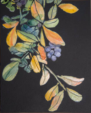
Right now, I am lucky enough to have two studio spaces in our house. On the main floor is the studio I have used for over 13 years. It contains most of my art supplies, my computer and my easel. On the lower level, taking up the space where my husband’s pool table used to be, is my print studio. I have several tables to lay things out on as they dry. My Cricut cutting machine and gel plates are there as are the Golden Open acrylics I use to make my gel prints. Plus, many stencils and stamps I have created and things I have found to make marks with over the past 2 years. On the way back up the stairs a moment ago, I was thinking how some of the most interesting things I have created were created “on a whim”. In the midst of doing something I went there to do, I threw something on the plate and pulled a couple of prints just because. And those prints often become an important element of a new work. That lead me to think about the past 4 years and how my art has changed so much. And most of those changes were done by following a fleeting idea. So, I went back through the last 4 Novembers and pulled these out to show you! In November 2020 I was known as a landscape artist and painted Twisted View (acrylic on canvas, 24” x 30”): 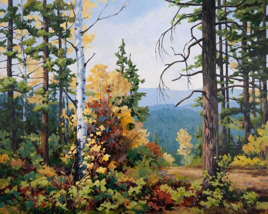 I had been experimenting with tangled vegetation and the patterns in them when, in November 2021 I painting Mellow (acrylic on canvas, 16” x 12”): 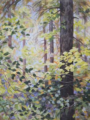 Then over the next year I began experimenting with custom made stencils and my gel plate, pursuing the tangled vegetation but combining that with more geometric and man-made elements. So, in November 2022 I was creating my GeoGanic series of monotypes like No. 10 (acrylic on Dura-lar, 10” x 8”): 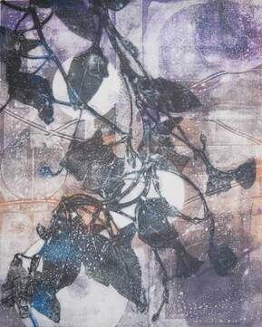 Embracing experimentation has led me to where I am currently, using gel prints as collage elements along with paint to create similar but much more complex mixed media work like Tear Here to Open (mixed media including acrylic and collage on canvas, 18” x 14”): 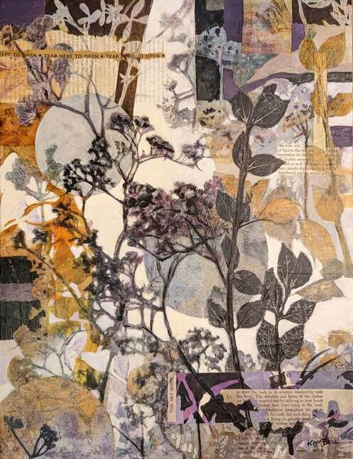 The quick, simple prints I created this afternoon are for my current work-in-progress. I needed some collage stuff with Ultramarine Blue. Of the 10 prints I pulled, one that I created “just on a whim”, turns out to be the perfect next step for my work.
I wonder what I will be creating next November!! I hope you are having as much fun with wherever your journey is taking you as I am! Happy creating!
6 Comments
I have really enjoyed making and printing the stencils of branches and trees. And I learned a lot! So, I decided to take what I have learned back to where I started, using the stencils of the flowers. I enjoyed working with the flower stencils on Yupo but wanted to experiment with darker backgrounds. I realized that I could use the stencil to print a background using the gel plate. I applied paint to the plate and then lifted the paint through the stencil to remove it from the flowers using tissue. Then I lifted the stencil and printed the ghost on Arches. I can get it very dark and rich looking. 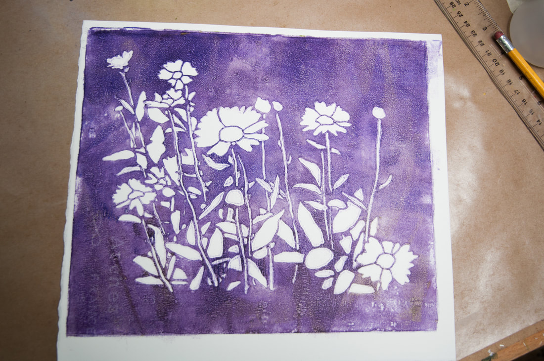 Then I painted the flowers in either watercolour or watercolour pencils and sealed them with gel applied through the stencil. The result is mounted on cradled panel. Where the gel is applied, the colour is richer and the contrast of the glossy vs matte background is interesting. 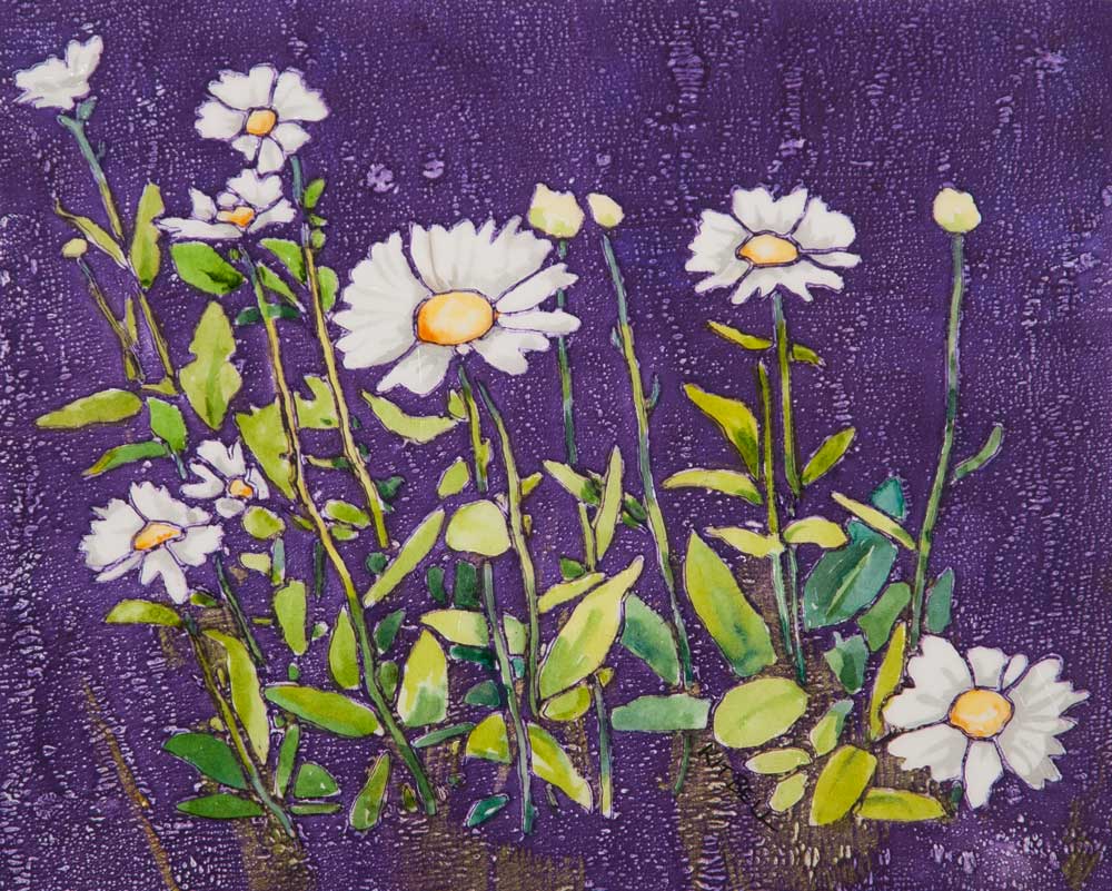 I am getting a fascinating assortment of tissue which I use to lift the paint from the flowers. Some are very beautiful. Hopefully I will think of a way to use these down the road. 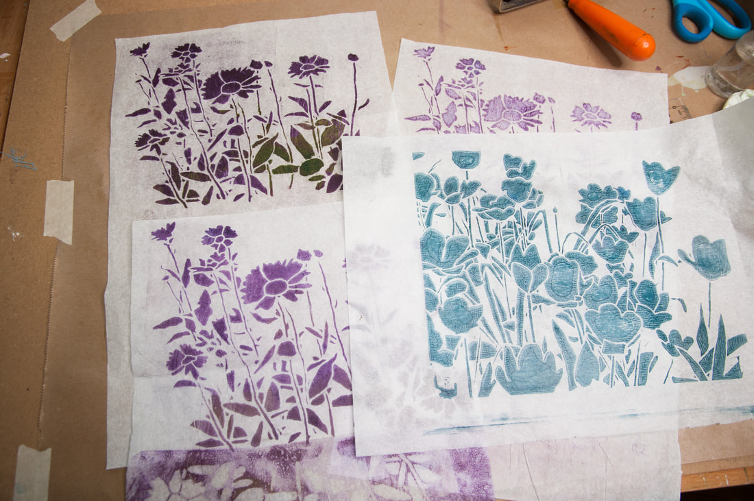 It is great to get more mileage out of the flower stencils. These look very different than the ones I created on the white Yupo at the beginning of my journey. With that success under my belt, I decided to do another bird painting. I chose two branch stencils which looked good together. I decided to experiment with the process. I did my initial rollup of brown paint for the first tree and removed the negative areas with tissue (again adding to my fascinating pile of printed tissue!). Then I used a smaller roller and applied some yellow green over the stencil in some areas. Then I removed the stencil, applied the bird mask (to keep that spot clean) and printed it on Arches. Then I rolled, removed and printed the second branch stencil. I did 3 prints all together but only liked 1 of them. I finished the robin with watercolour pencil. Once it was cropped and mounted on cradled panel, I applied soft gel through the second branch stencil to finish it. 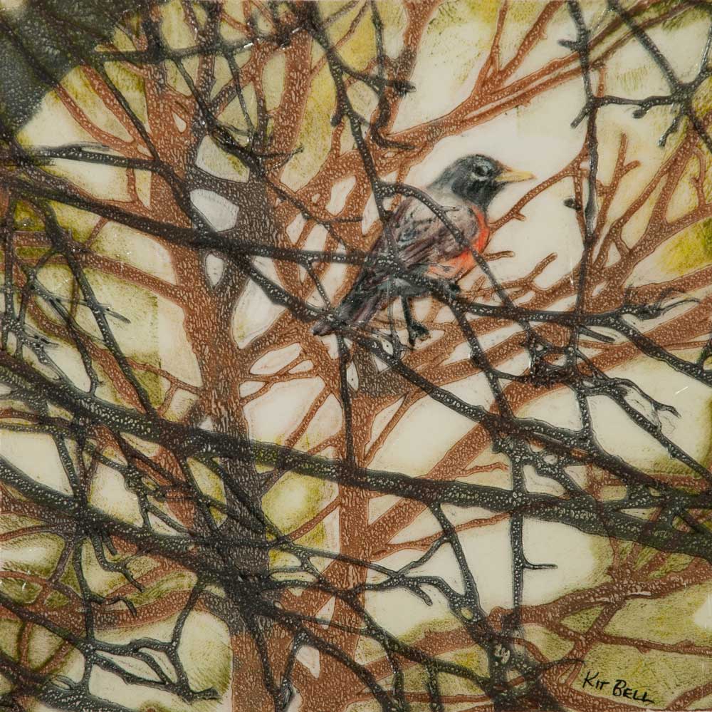 Now, back to the big tree!
(Note: this is the 8th post about this adventure I started in January 2022. If you enjoy this post, you might want to start at the beginning!) The thing about exploring new ideas – my rabbit hole – is that you never know where it is going to lead. I was enjoying painting flowers on Yupo with my stencils. I entered some in FCA juried shows and had them accepted. The feedback was very positive and some sold, which is the best compliment that someone can give your work - taking it home with them. The birds haven’t been entered in any shows yet but it will be their turn soon. But this work was all fairly small. The largest was 10x10. I was limited by the size of stencil that I could cut with my Cricut and by the size of the Gelli plate I had. The small scale was starting to chafe. Just about this time, I ran into Carney Oudendag at Grizzli Winery during the switch over from the Ode to Spring show and the Grizzli Gallery Show. Carney is one of my favourite artists. She works with mixed media and creates the most amazing paintings! We chatted about stencils and Gelli printing. She mentioned that she had made her own gel plate. She also mentioned printing on tissue and deli paper. It was like a light bulb went off! Printing on tissue!!! That could open up all sorts of possibilities and new burrows to explore in my rabbit hole! I started printing on tissue paper. You have to be reasonably quick to make the impression and get the tissue off before it gets too sticky. I then tried applying the tissue print to both paper and canvas. It works just like a layer of paint. The tissue kind of vanishes, leaving just the acrylic. I realized that I could create multiple stencils that connected together. I could print them on tissue and apply them to a larger canvas! It is like I poked my head up out of the rabbit hole and found myself in canvas land with all sorts of possibilities ahead! As long as I can print and join the tissue well, I could make just about any size of artwork. The freedom from a limited number of fixed and small sizes felt just great. My first project with multiple connected stencils was a tree (I mean, really, did you expect something else!!). This is what the 4 stencils look like put together. Each stencil is 10x10 and each took 3 to 4 hours of work in Photoshop to create. 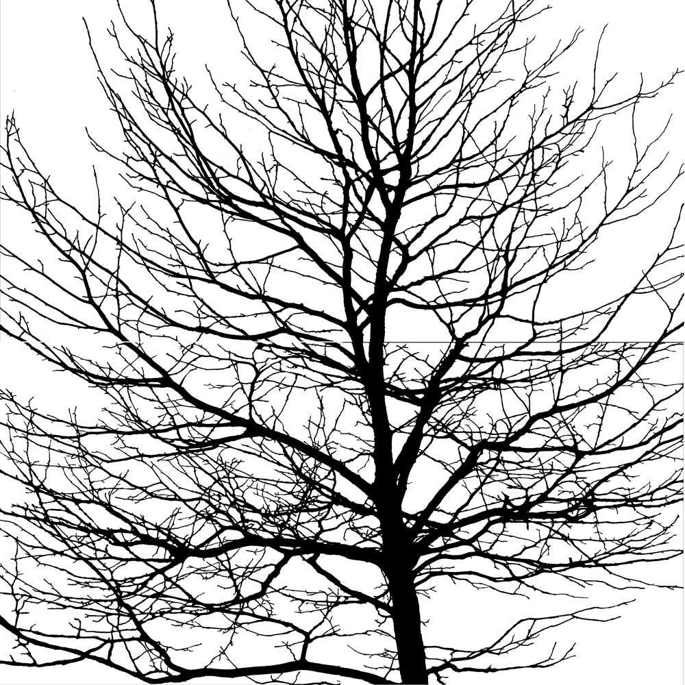 And here is how I created a 16x16 painting with them: Step 1 - Underpainting of the canvas. I followed the image of the four stencils and putting in colour in Nichol Azo Yellow, Quin Gold and Anthraquinone Blue. I dampened the canvas to start and then used fluid acrylics, dropping it directly onto the canvas and brushing it out with a 2-inch brush. 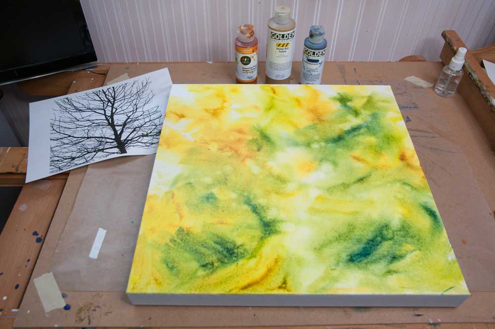 Step 2 - Creating the prints. I used my 8x10 Gelli plate, rolling out mostly Anthraquinone Blue with some Transparent Red Iron Oxide here and there. I placed the stencil on the Gelli plate then I did the 1st pull on tissue, getting into all the crevices. I cleaned off the negative spaces with copy paper. Then I lifted the stencil and printed the ghost on tissue - this is the one I will use for this project. I am hoping that the 1st pulls on tissue will be useful down the road. 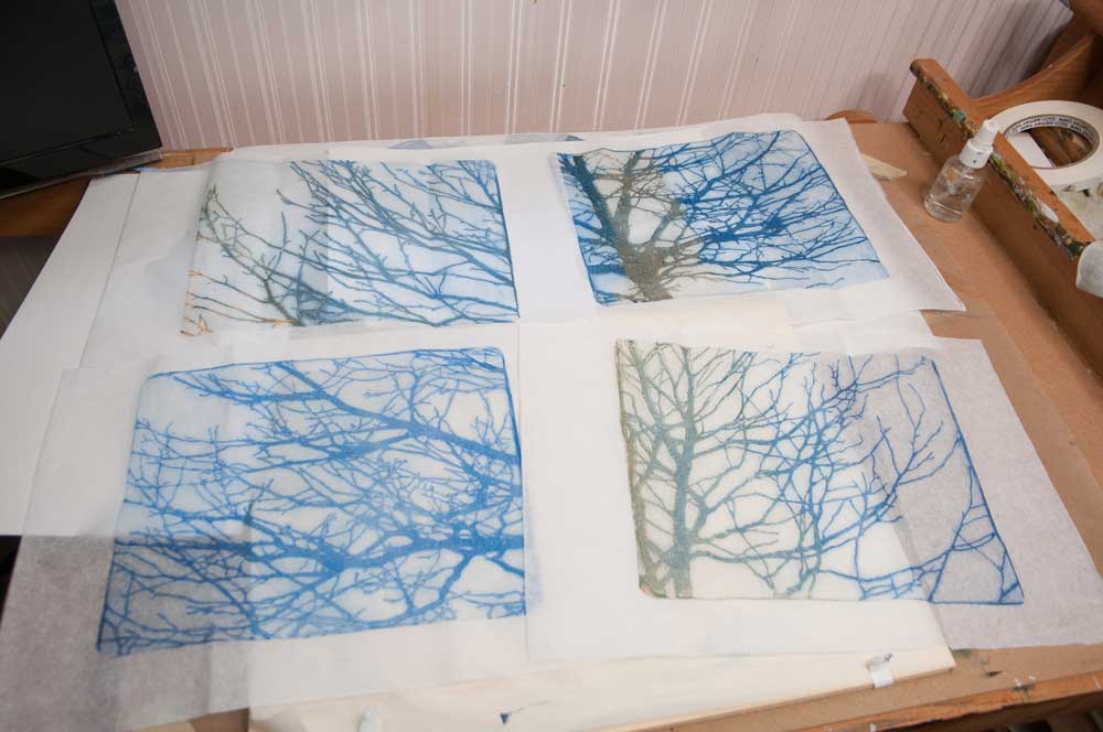 Step 3 - Negatively painting the sky and sky holes on the canvas. Using Cobalt Blue, Titanium White and some heavy gel, I painted the sky, creating the shape of the foliage. I used the stencils as a guide as to where to place the sky holes. 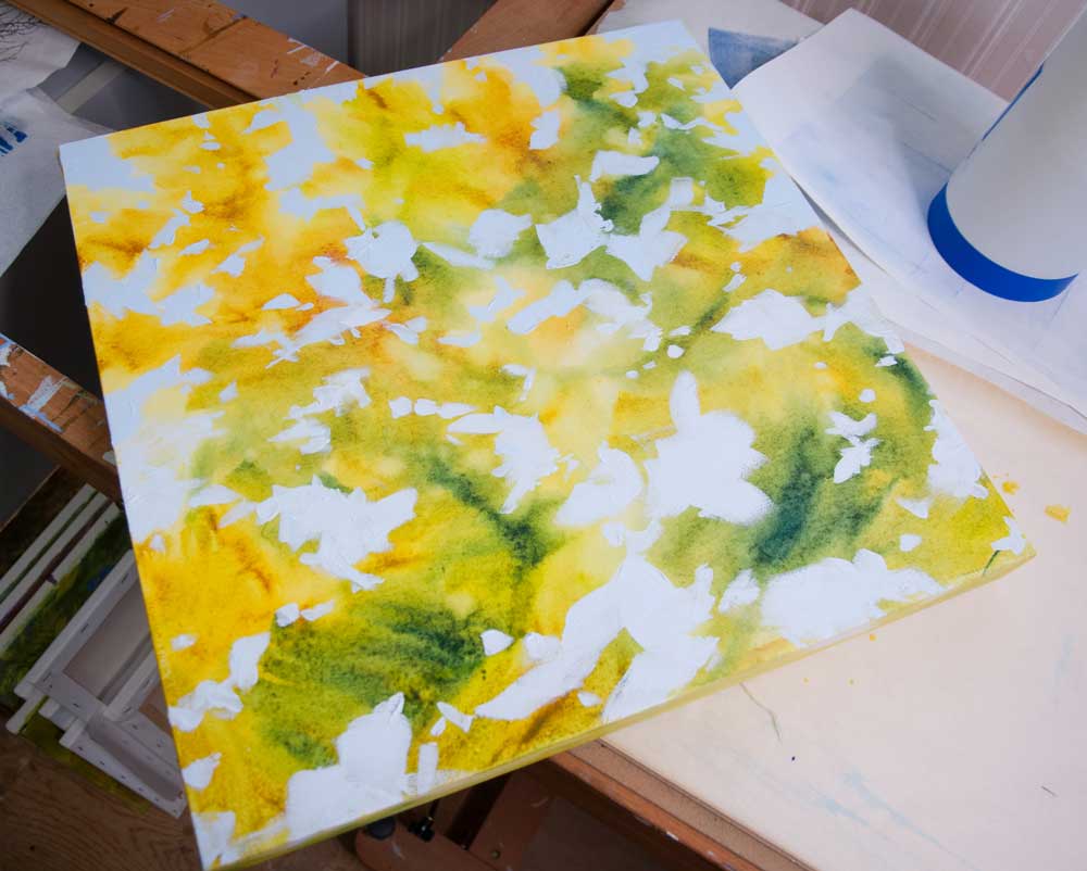 Step 4 - Collaging the prints. I trimmed the excess tissue from the prints, trying to leave a good edge where the prints have to match up. Then I collaged each onto the canvas. I found that you can paint over top of the tissue to adjust composition and repair areas where the collaging process wasn't perfect. 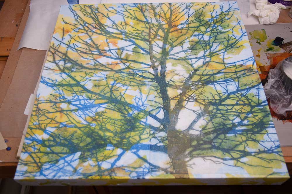 Step 5 - Applying soft gel through the stencils. This enriched the colour of the foliage and created a beautiful surface. The contrast between gloss and matte adds further interest. 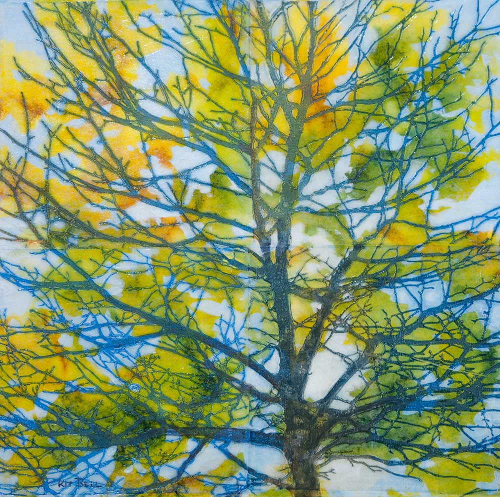 The beauty of creating the four tree stencils is that each individual is interesting on its own. Stay tuned to see what I have created with them!
I love the stencils of branches I have made – and I have made quite a few! It is interesting to see how different stencils in different colours combine with each other. I felt that I was in a place to start to create some work that I could potentially send to shows. Because of my art school background, this meant that I needed to be sure that my materials were permanent and archival. The cardstock I have been using is both acid-free and lignin-free but it is still a wood pulp product and buckles whenever any water or water-based products are used. I decided to try out some printmaking paper I had used in the past – Rives BFK, and some Arches 90 lb Hot Pressed watercolour paper. The Hot Pressed is much smoother than the standard Cold Pressed watercolour paper and I hoped that the 90 lb would be light enough to get a good impression from the Gelli plate. I purchased the paper from my local OPUS store and cut it up into pieces that would work for my 8x10 plate. The result surprised me. I really thought the printmaking paper would win! After all, that was what I was doing, right? Printmaking? I printed up a few sheets of both. BFK: The paint is lighter on this paper. This may be because it is more absorbent. It gives a good crisp image. It works okay with water-based techniques such as water-soluble graphite and watercolour pencils but it won’t take a lot of water. Arches: This paper produces a richer colour than the printmaking paper, similar to what I was getting on the cardstock. I am thinking that the paint stays more on the surface because of the sizing. This is good for prints that need a bit more colour. It produces a nice crisp image. And, of course, it is made for water-based techniques and can deal with a fair bit of water. So, my conclusions for what types of paper are best for me, for various uses are:
Here are some examples of my new bird mixed media work: I love paintings birds as a break from my trees. Over the years, I have used various techniques to bring my birds to life: Gouache and Ink Resist, mixed media and acrylic. I have painted them for friends, shows and fund-raisers. Here is a sampling of my bird paintings: The flowers are very interesting and have yielded a few good pieces in my explorations but I would like to integrate the background better with the subject and layer the stencils to develop more complex images. I think birds would give me more opportunity to do that, so for now I am going to work with them. I started creating stencils of branches. I am amazed at how intricate a stencil the Cricut machine can cut. By now it was taking me 3 to 5 hours of working with an image on the computer to create the digital file for the Cricut. Fortunately, I enjoy that part of the process and have good computer skills. I created a few simple masks of sparrows to combine with the other stencils. (A stencil and a mask are opposites of each other. When you paint through a stencil, you create the subject. When you use a mask, you paint around the subject – negative painting.) I set up my Gelli plate and pulled out my Open acrylics. I started just using copy paper to play around and experiment with, and then expanded to cardstock. Here are some of the early experiments. In general, I used two stencils with two colours. Some were printed directly and some were “ghost prints”. In some, I enhanced the images of the birds with graphite or watercolour pencil: So these are experiments on cardstock - sorting out the process and refine the images. Cardstock prints well but has issues with anything with water in it. It buckles. I needed a better, more permanent paper to work with. Stay tuned for the results of my paper experiments and some more information about the process itself!
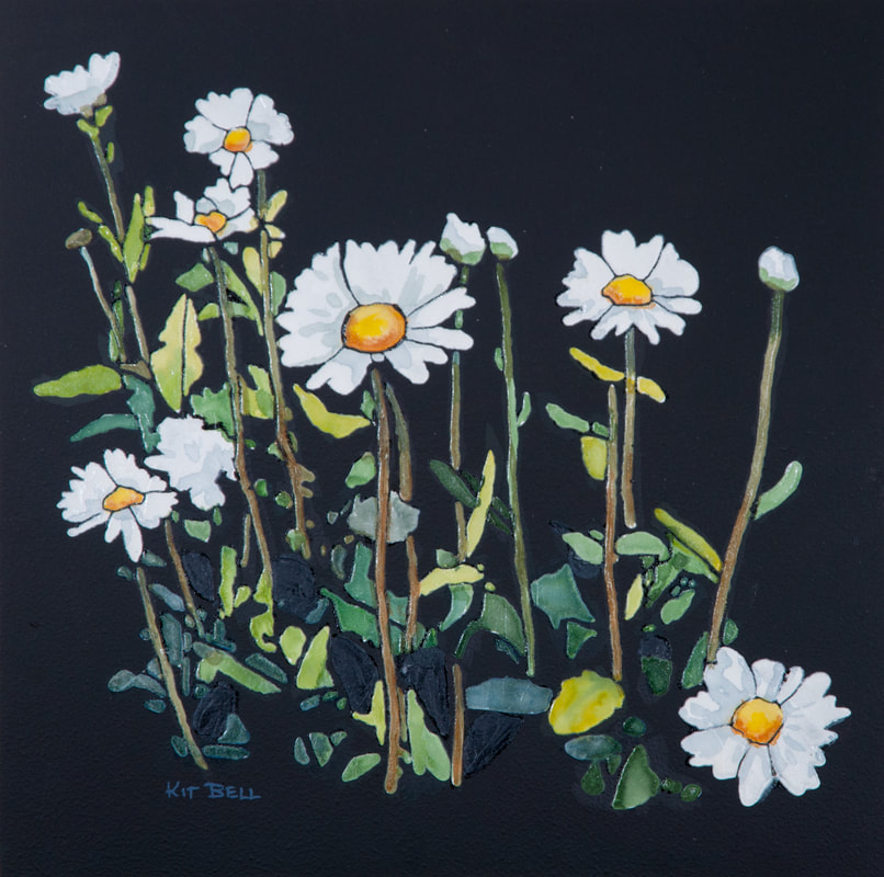
So, I am burrowing down my rabbit hole, making interesting and intricate stencils of flowers and painting them on Yupo. Then I created a stencil of white daisies – and suddenly I realized that I would need a dark background to really set these off. I tried to paint a dark background on Yupo but I wasn’t happy with the results and I am thinking what I really needed was black. I took a piece of Yupo and applied black gesso on it with a sponge roller. I have done this before. It creates a nice matte black background. My first thought was to work with pastels on top of it. And then to put gel through the stencil to protect the pastel. It worked but wasn’t quite what I wanted for the daisies. 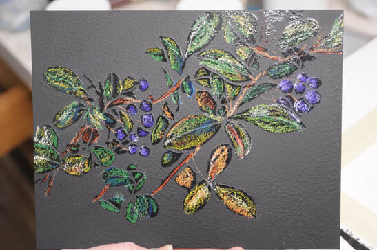 Then I took a piece of black gesso’ed Yupo and applied absorbent ground through the stencil. (Absorbent ground, also known as watercolour ground is a white, opaque goop in a jar. It is made by Golden and Daniel Smith.) That got the white back and created a surface I could use watercolour on. I painted the daisies with watercolour and then applied gel through the stencil to seal it and create a nice gloss on the flowers set against the matte black background. It came out beautifully!
 This has been a very satisfying branch of the rabbit hole and has brought excitement back into my art practice. But now it is time to change things up! I am wondering how my stencils would work in combination with my Gelli plate. And I want to introduce birds into this exploration! Stay tuned…
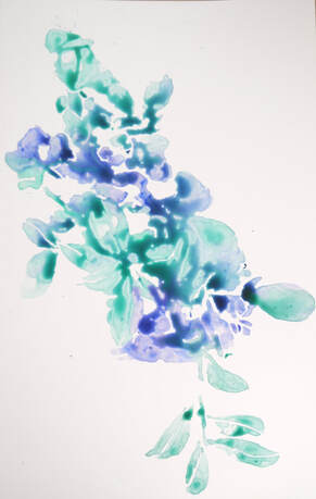
In my last post, I still thinking “conventionally” about stencils and not finding it very stimulating. And then I had a happy accident. Applying all that gel through the stencils would leave a fair bit of gel on the stencil when I removed it. So, to save the gel, I put one of the stencils down on one of those grey disposable palette papers and scraped the gel off with the knife and put it back in the jar. The next day, I caught a glimpse of the shape of the stencil on the palette paper. It was shiny against the matte paper. And a light bulb when off in my head! I pulled out a piece of Yupo which I had purchased years ago and disliked because the watercolour just puddled and ran all over the place. Now, I am thinking that could be a good thing. I applied some watercolour to it and let it dry. Then I used the stencil to apply gel to the Yupo. Once the gel was dry, I washed the excess watercolour off. Here is the process:
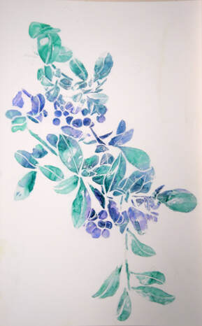
Oh, this was fun! My stencils had been getting more intricate so I started to focus on stencils that would BE the composition rather than just a part. It was amazing how intricate a stencil the Cricut machine would cut. Now I was on a roll, creating intricate stencils on the computer and trying out different colour schemes on the Yupo. Here are a few of the results: But the journey didn’t end there! Oh, no! It had just begun!
When you have been painting a certain way for several years, it is hard to shed old habits. Initially, I was thinking of stencils as shapes. I created stencils of bits and pieces that I hoped I could use as part of an artwork. I picked flowers as the subject matter because I don't really paint florals - I don't have any fixed idea of what this subject matter should look like. And it is close enough to my vegetation work to enjoy it sufficiently. I took an old demo canvas and put a layer of Titanium White over it to start fresh, then used different kinds of gel applied through the stencils of various kinds of flower stencils with a palette knife. Here are some of the stencils of flowers and foliage: 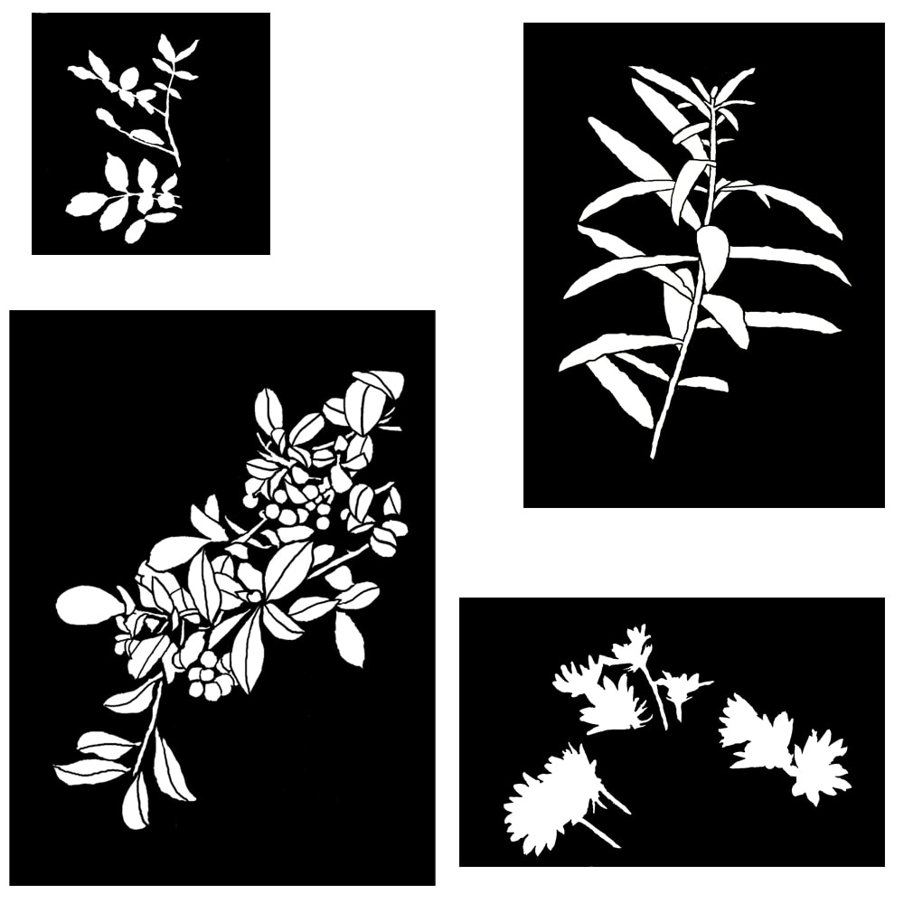 Trying to think about composition, I built up quite a bit of texture on the canvas. I was still using the stencils here and there as shapes. Then I applied some glazes over it so that I could see the shapes better. I started to apply some veils and opaque paint, some of it applied through a stencil until I got here and got stuck: 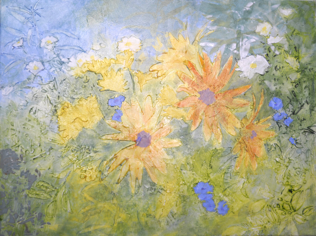 I lost interest in this one because I really wasn’t sure how to move forward with it. I wasn’t really satisfied using stencils as just components and it didn't feel new and exciting. And in the meantime, an accidental discovery sent me in a completely different direction that did feel exciting!
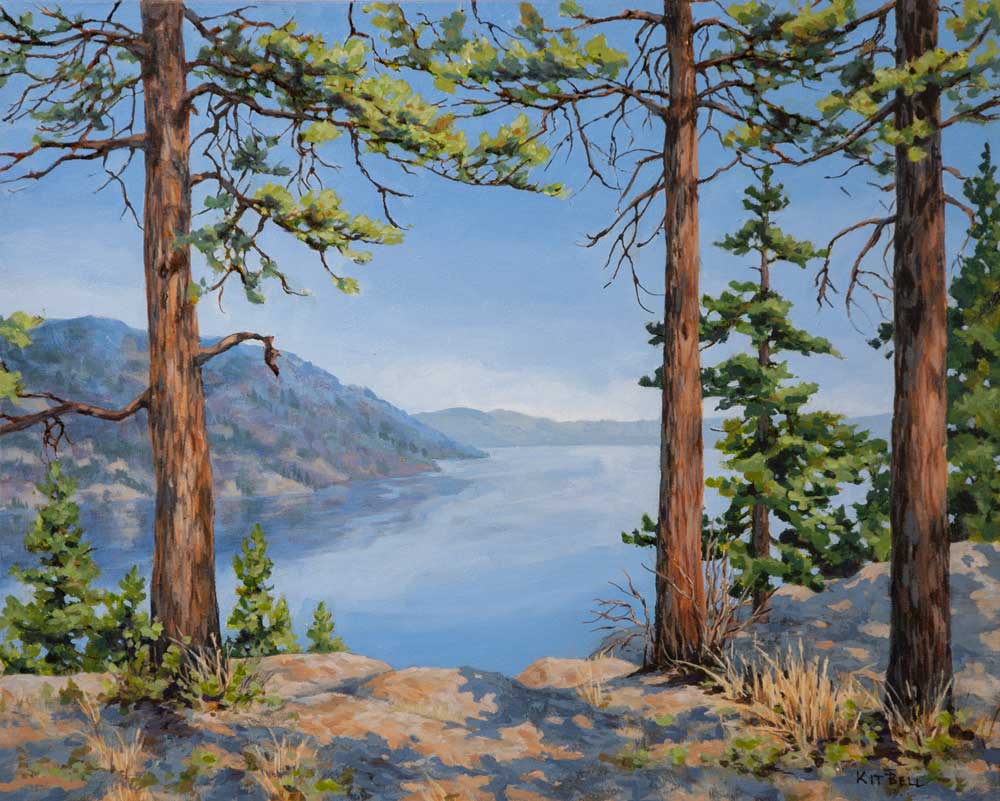
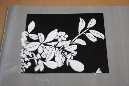
This rabbit hole had two inspirations. The first was a workshop I was asked to teach in Osoyoos in February on Impressions of Nature. It was going to be an in-person workshop on stencils and moulds but COVID converted it to online classes on more conventional topics. But I created a couple of demo videos (one of the videos is at the end of this post) in preparation and that got me thinking. Then, I was talking to my Central Okanagan FCA mentees about Repetition with Variation and it got me thinking about the greater use of stencils. I discovered that you can cut your own custom stencils on a Cricut cutter, creating or refining your images on the computer and then using the machine to cut the stencils themselves. So, I got a Cricut machine and started to explore, creating stencils that are more intricate than those that I could cut by hand. I discovered that I really enjoy creating the digital part of the stencil from my photos and using Photoshop to modify and refine. A lot of the design and most of the composition decisions are made here. The Cricut machine allows me to cut the same stencil in different sizes and you can play with just a part of a stencil so there are lots of ways to use a single digital image. Here is an example of a more intricate stencil I made: 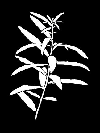 The next installment will be about my explorations of using my new stencils! This video was made as a promotion for a course that never happened but it shows where I started. For years, I have been painting landscapes in acrylic. I seek out the quiet places in the forests or overlooking the lake, places where I can relax and get away from the bustle of everyday living. Since the pandemic started, my everyday life has become very quiet and my landscape painting has slowed and stalled.  This year, I have begun experimenting with new techniques and processes. My colour palette has changed from soft and natural to bright and cheerful. The paintings have become busier and more optimistic. For me, this helps to offset the quiet of the pandemic. I am enjoying making art again! I thought I would share my explorations with you – my journey: Down The Rabbit Hole There is an explosion of creativity when you let yourself follow a rabbit hole. Once I give myself over to the rabbit hole then my job is to follow it where ever it leads and there is only one rule: Think it, do it. Because if you don't, then you will forget about it and about that flash of curiosity and insight that happened when you thought of it. I like to document my search. A few short notes and a photo or two of the process is enough for me to come back later and pick it up. Or think of a new branch to the rabbit hole! I also like to keep all the little experiment pieces so that I can look back at them and remember. 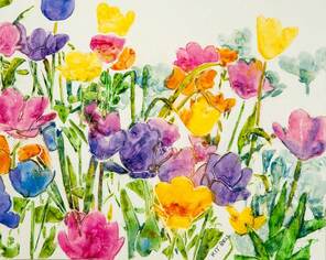 PS - It helps if the experiments don't take too much time. It allows more parts of the rabbit hole to be explored without losing interest.
I am going to set myself the goal of posting on this blog once or twice a week. So check here frequently to see where the rabbit hole leads! So many artists that I have talked to have expressed their difficulty in creating art while the pandemic rages around the world. At the beginning, it was like the creative world stopped and held its breath. I was no exception. As we all adjust to the “new normal”, I find that my ability to paint and be creative comes and goes. But that is normal. When life is busy, there is no energy left over for painting. I like to think of it as a bottle of milk. Not the homogenized version of today but the one we used to get in a glass bottle, with both the skim milk and the cream. Every day, we get a new bottle of milk. That is the energy we have available for the day. As we go about our daily lives, we use up the milk. Now, the skim milk we can use for lots of things – cooking, errands, socializing, and walking the dog. But to be creative, we need the cream. When you have cream available, you can draw, paint and be creative. But when all you have available is the skim milk, you can’t. When life gets too busy or too stressful, it uses up all the cream and nothing is left for art. But as things quiet down in your life, more of the cream is available and we start to create again! So, if you find yourself not doing much art these days, don’t despair. That feeling will pass and you will paint again.  Complicated, 16" x 16", Acrylic on Canvas utilizing acrylic skins made from molds that I created using plants and leaves! I love to paint but as most of you know, I am also a computer geek. So when these two things come together, what you get is this! Here is a short video (about 36 seconds) of the development of a recent painting "Intimate", 20" x 20" done in acrylic with some tissue paper collage along the way. For a description of the development of the painting, click on the link below.
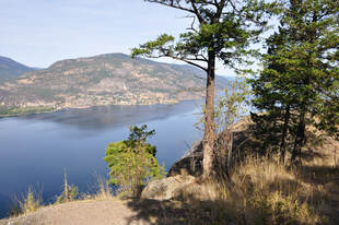
 So, earlier in June, I posted a blog about Problem Solving Tools. I needed to improve the foreground of the painting I was working on of the view from Knox Mountain here in Kelowna, BC.
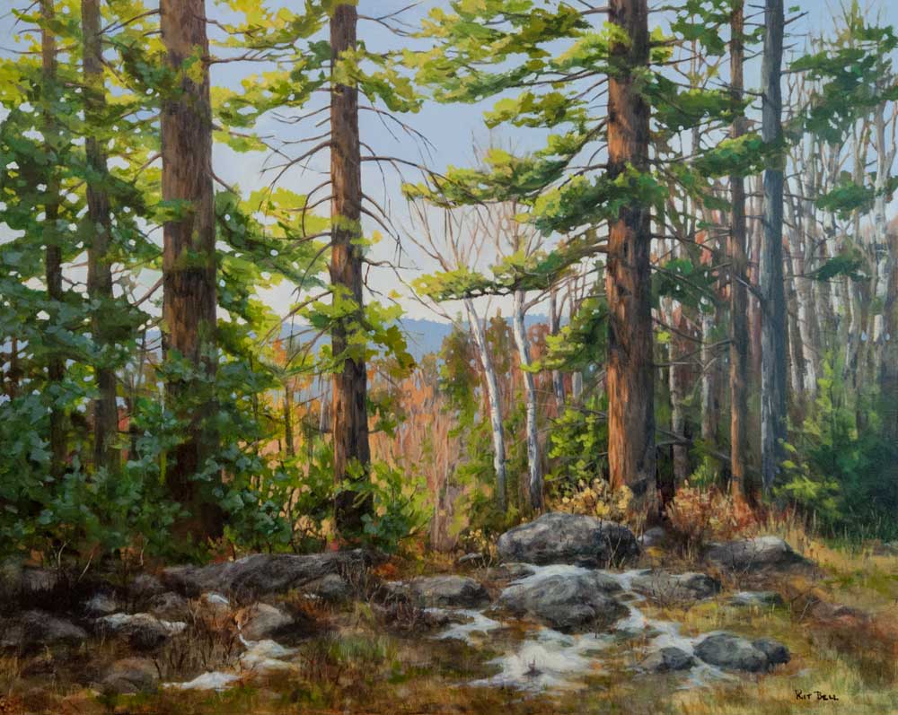
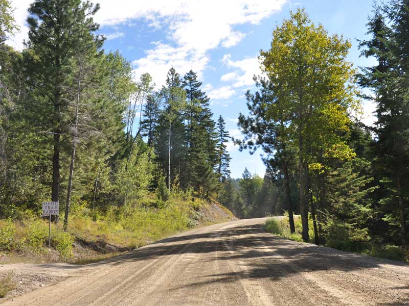
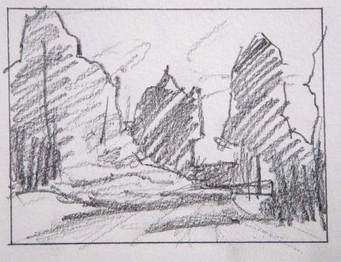
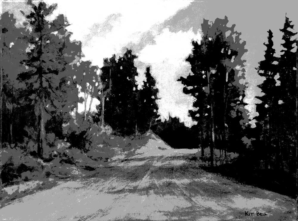
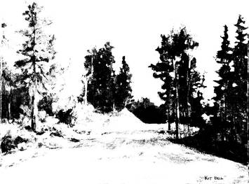
I thought I would show you how the painting turned out! Here is "Over the Edge", 16" x 20", done in acrylic. I have found over the years that almost every painting, no matter how much thought and planning has gone into its design before starting, goes through a phase which requires problem solving. Perhaps the overall design is solid and the issue exists in what to do with a corner or other section of the painting. Whatever it is, if you don’t solve it in a way that supports the rest of the painting and your original intention, the painting will be, at best, a second-rate work. My current landscape is suffering from a boring foreground. The reference was taken a few years ago up at Knox Mountain in Kelowna. They keep the park pretty tidy! I was drawn to the view because of the branches in the trees and how the shapes they made moved across the top part of the painting.  I used a couple of thumbnails to work out the best structure. Removing the small tree in the middle and replacing it with some trees on the left will allow the viewer to look through the scene to the lake and mountains. You will see some faint lines from a Harmonic Armature that I used to assist with the design. 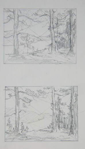 I started working on this painting over a year ago and abandoned it although at the time, I wasn’t sure why. I started back with it recently after finishing some other paintings. I realized that although the thumbnail is really interesting, when I put it on an 18x24 canvas there just seemed like a lot of empty, uninteresting space in the foreground. 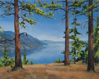 When I have an area of a painting that I find distressing, I will paint it out with a light value colour suggested by the painting. No picking away at it! Just block it out. But in this case, I needed to come up with a bit of a plan before tackling it again. For this, I find tracing paper an excellent tool. I marked in the positions of the tree trunks and then attached the tracing paper to a white drawing board. I then went through references from the same area and, using ideas from several, sketched in boulders, grasses, shadows and bushes putting them together in a way to make sense with the existing elements and lighting. 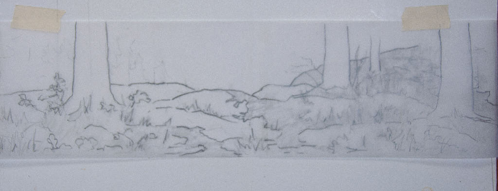
When I put the tracing paper back over the bottom of the painting, I was very pleased with the way it integrated into the painting, providing interest and support without taking over. I am now looking forward to working on it and will post it when it is finished! 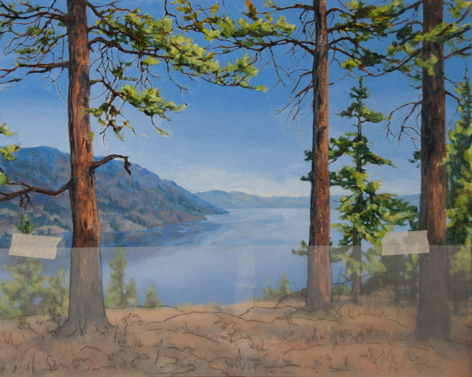 I am very pleased to be doing a demonstration at OPUS on Saturday, November 24th at 10 am and 1 pm. I will be demonstrating how I start with a loose underpainting such as this one: 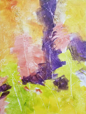 And then develop it in layers with both negative and positive painting, transparent and opaque paint, into the finished image: 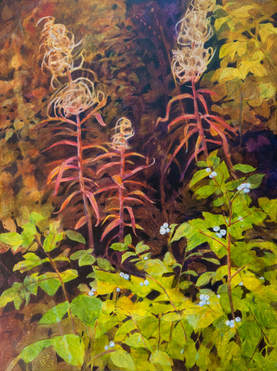 I will be starting with a PowerPoint presentation. For those of you who are interested, here is a copy of the presentation and notes.
 "A Chill in the Air", 24" x 30", Acrylic on Canvas, $800, Available. After getting back from our annual fishing trip and letting the dust settle, I found an image I wanted to paint. The photo reference is from 2009 and I keep going back to it. For some reason it interests me. It was the end of October and after a bit of snow had fallen and mostly melted. 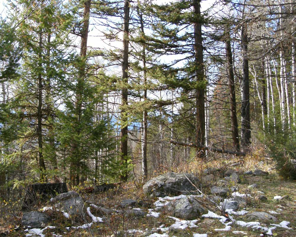 The image as it is, is a bit complex and busy. So, I did a thumbnail of it, simplifying the trees. 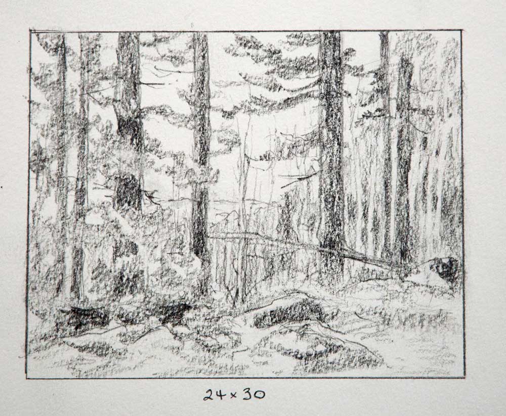 I liked that design so I transferred the drawing and got the underpainting started. After a few layers of underpainting, I started to paint the sky in negatively. At this point, I wanted to look at the painting and decide where it needed to go next. But looking at the painting itself doesn’t always allow the analytical side of your brain to work best. And this painting is too large to hold up to a mirror. So, I photographed the painting and brought the image up on my monitor. It is very helpful to see the painting on the monitor. It allows your brain to see it in a different context - almost like you have never seen it before. I made note of a number of changes I needed to make. I am starting to see where the streak of light is coming in. It is almost time to paint that! I am also seeing an X in the middle ground birches that has to go! 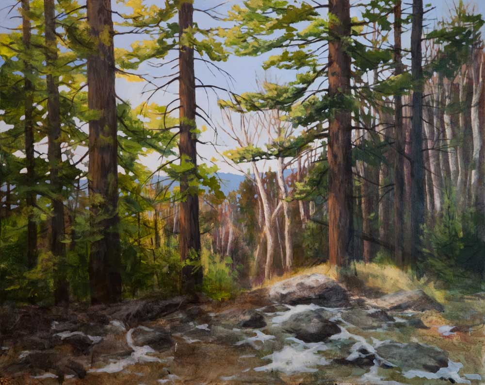 I got some work done on it but life intervened and progress was slow. The paint on the Sta-wet palette was starting to deteriorate. I finally had to throw out the paint, paper and sponge. I take pride in getting a good 3 months out of a sponge but when you just let the paint sit and not open the palette for days and days, such is the result. I felt better getting fresh paint out and made some nice progress on the painting. I did quite a bit of work introducing cool greens on the left and develop that foliage. I also did some work on the foreground. There are little things here and there that I made a list of. The final result is at the top of the blog. Here is a slide show with the various stages of development:  Just recently, I taught a two-day workshop on taking your painting to the next level. I had a great group of participants and thoroughly enjoyed the experience. This workshop was targeted to painters who have become comfortable doing what they do but who would like to take their art a bit further. In my experience, this generally requires more focus on design and composition and being pickier about what you choose to paint. You want to choose something that you are excited about. The passion will show. On the first day, we discussed composition and looked at some tools to explore the subject more completely before starting a painting. I am talking about thumbnails, value studies and notans. I had some reference photos handy on my computer, picked one that struck me in the moment and created the following thumbnail as a demonstration of picking about 4 values and blocking in shapes in those values.
Choosing a good format (what size and proportion of canvas) figured extensively into the discussion. Multiple thumbnails allow you to experiment with different proportioned sizes and to choose the one that works best. Later, we took a promising thumbnail and did a notan (just black and white) to simplify the design even further and to see if any issues needed to be addressed. The top notan was a bit busy and was too even (50% white and 50% black). The lower notan assumed a high key painting (over all lighter) and gave me a more interesting design. 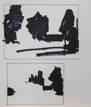 When getting organized for the workshop, I had planned to use a different reference for a painting demonstration but I was not excited about it. As the day wore on, I became even less excited about it. A value study demonstration really showed the weaknesses of the reference. But the reference, thumbnail and notan that I had done as demos that morning did grab my interest. So, on the spur of the moment, I decided to go with that as my demo painting. The demo painting went well. I did a quick underpainting on day 1 and on day 2, demonstrated how to correct value issues and also various painting techniques. Here is the painting (finished after the end of the workshop):  Once I finished the painting, I was curious to see if my painting reflected the composition I had worked out in the thumbnail and notan. I used Photoshop Elements to change my finished painting into 4 values and 2 values:
This painting may or may not be an award winner but I think it is a very solid effort. And it clearly demonstrates the connection between good planning and good painting!
Happy painting! 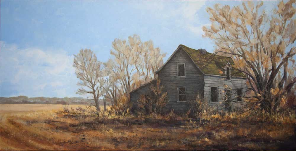 November 26th I will be doing two presentations at OPUS Kelowna on Mastering Perspective in Your Landscape Painting. I will also be doing this presentation at OPUS Victoria in March and at OPUS North Vancouver and OPUS Langley in April. Here is a copy of the PowerPoint presentation I will be giving (fully annotated!). Saves taking all those notes! Enjoy!
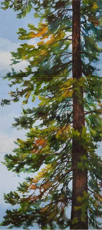 So this is the painting that started life as three separate demos. The topic was Negative Painting for Positive Results and I used this tree as the subject for several of the demos.
When fellow artist Carney Oudendag brought some of her paintings to my studio to be photographed, she suggested that I could combine these three into one large painting. I was delighted with the idea because I didn't feel that any one of them stood up as individual paintings. Together, they make one great tree! It took me some time to complete the triptych as other things kept getting in the way but I am very happy with the way this turned out. Thanks again, Carney, for the Best Idea I Never Had! So, this is the story of the best idea I never had! A couple of days ago, fellow artist Carney Oudendag brought some of her paintings to my studio to be photographed. I met Carney at last year’s Lake Country Art Walk in one of those 15-minute Paint Off’s. As I was processing her images on my computer, we were chatting about this year’s upcoming Art Walk and about doing demos for OPUS and other art organizations. I mentioned that I had a stack of unfinished demo paintings. While she was waiting for me to finish, Carney started to look through my stack of rejects. “These are really quite good – for demo paintings” she says in a bright cheery voice. While I was trying to figure out how to process that, she brings three out. They are each pretty much of the same section of the same tree. I quite like these three but felt they didn’t stand up as individual paintings. When I demo, I like to have the same image in different stages of development so I can demonstrate a wider range of techniques but individually – I didn’t know if they are all that interesting. Then Carney did an amazing thing! She stacked up the three paintings one above the other and declared “look, a triptych!” 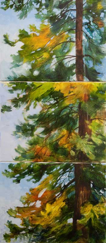 I was dumbfounded. I had never thought of doing that. And what was really amazing was how well the three paintings fit together to make a quite impressive larger painting. Obviously, it needs some work to pull it all together but the potential is there. As artists, we tend to work in isolation, painting away by ourselves in our studios. But this is what can happen when two creative minds meet! So, I have two questions for you:
|
AuthorThe Okanagan provides inspiration wherever you look. I enjoy both painting on location and working in my studio. For more information contact me at [email protected] Archives
November 2023
Categories
All
|
||||||||||||||||
 RSS Feed
Gallery Pages |
Information Pages |