|
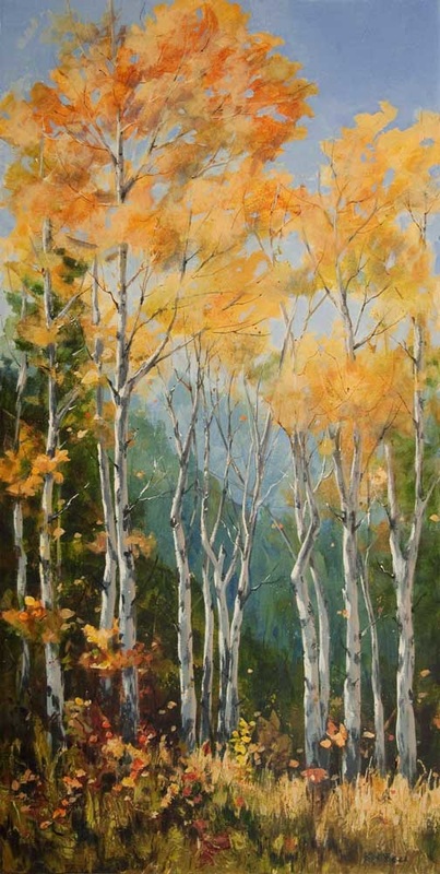
I find as I progress along the journey of making art, my creative process undergoes changes as I absorb information, attend shows and participate in workshops. I find it useful to periodically record how I went about creating a particular painting. Here is the story about how I created "The Clan", a 36" x 18" acrylic on canvas that I just completed.
Concept I saw this group of trees while Bill and I were out getting firewood. I sketched a similar group that was across the road while we were there and took numerous photo references. I worked out the concept on a thumbnail sketch and decided to make more transitions in the background to avoid a line going across the middle of the canvas. I decided to go with a format of 36 by 18 to really emphasize the tall thin nature of the trees. Beginnings I put on an underpainting of reasonably thick paint (not just a diluted stain) so that any areas that did not need further coats would have a reasonable quality of surface. I put on the underpainting in sections so that I could spray, scrape and move the paint around to get some texture. As I was developing the image, a strong diagonal from upper left towards the lower right appeared. I left this and accentuated it in later layers. I painted two gradations for the background hills to provide atmosphere and depth and another two for the middle and foreground trees. Then I painted in the trunks of the trees paying attention to the spacing of the trunks and the thickness, working on maintaining variation. I also referred to the reference photos and picked up interesting twists and turns in the trunks. Middles I started to work around the painting, adding some transparent and translucent layers to the foliage and to the background. I worked in sections so that I had the time to spray, wipe, scrape, etc to soften transitions and develop texture that suggested the subject matter. I painted in the dark green of the fir trees on the sides but the contrast was too harsh so I sprayed with water and wiped a bit to soften it. That worked very well to push them behind the aspens. I also worked on the light on the trunks, painting the darker middle, a duller, reflected light on the right sides and a brighter, direct light on the left. I started to suggest more branches. At some point I took some very diluted sky colour and splattered it around the painting. Later I glazed over some of the splatters to muted them without losing them. I added some texture to the foreground using paint mixed with gel medium and applying it with a painting knife. When that was dry, I dry brushed colour over it to give the suggestion of grasses and brush. Endings After evaluating it for a while, I decided that the value of the trunks and the background were too close so I lightened the trunks and reworked the direct and reflected light. There was a nice diagonal happening with the twists of the trunks so I hit them with some extra light in key places. I repainted the top right corner sky. It was too light and too busy so I went with an ultramarine blue thickened with some gel. The colour was a beautiful complement to the foliage’s yellows and oranges. I painted a limited number of sky holes and ratty edges to the foliage, trying to repress my urge to play with the patterns too much. I also applied some transparent stains of purple and green in parts of the foliage to give a sense of the light coming from the left. I used the Fineline nibs and some of the High Flow Acrylics to add fine branches to the trees. Some of the lines, I modified with a small brush to widen and merge with the trunks. The last thing I did was modify the foliage that was on the left coming down into the foreground and I added some dots here and there of leaves.
6 Comments
11/15/2015 09:51:45 am
Perfection! I can stare at this a long time Kit! Love the peaceful quality embed in your paintings! Thanks for sharing your process. ❤️😊
Reply
Kit Bell
11/15/2015 10:29:07 am
Thanks, Renata! I am working hard to incorporate the techniques from the workshop into my work.
Reply
Joan Bolen
11/15/2015 01:24:44 pm
Love this painting Kit. The highlights and the purple and green make the WOW factor. I also really like the description of your process.
Reply
Kit Bell
12/23/2020 09:35:55 am
Thank you, Nora! This post is from a while ago. When I got the notification of your comment, it gave me the opportunity to re-read it. While my process varies a bit from painting to painting, it still follows these basic steps.
Reply
Leave a Reply. |
AuthorThe Okanagan provides inspiration wherever you look. I enjoy both painting on location and working in my studio. For more information contact me at [email protected] Archives
November 2023
Categories
All
|

 RSS Feed